
Alas. The ultimate nightmare of every. single. designer out there. It was certainly my nightmare when I was starting out as a designer. It still is.
So, how to pair fonts? How to mix fonts in a way that they go well together and they compliment each other? How to blend fonts so that the final design is appealing, serves its purpose and delivers the right message?
What is font pairing
Let’s start from the beginning, since this post is font-pairing 101. (A follow up for advanced font-pairing might follow!) Font-pairing is when you mix two or more fonts in a work of art (it might be a logo, flyer, cover etc). Depending on the result, it can vary from effective, when it brings out the right message, to utterly funny, when the design doesn’t work. But how can we pair fonts in an effective way?
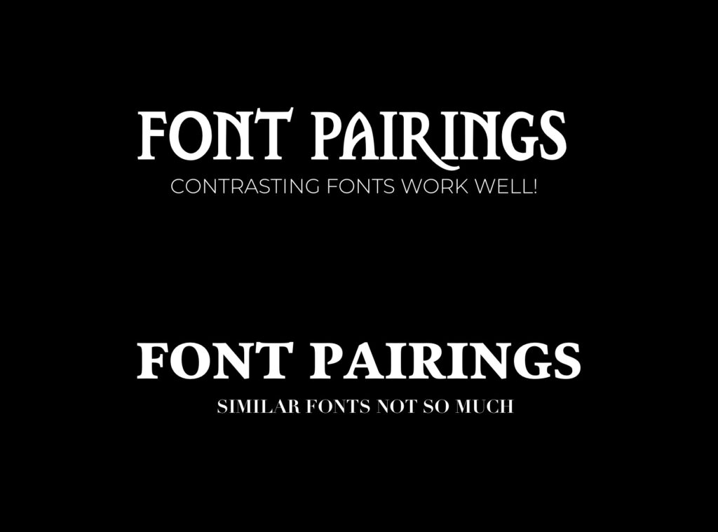
1) Choose Contrasting fonts
Yep, welcome to font-pairing 101. This is the first advice you are given by pretty much everyone. When in doubt, choose contrasting fonts. Mix uppercase with lowercase, serif with sans-serif, ornamental with simple. Ok, sounds good. So… are we done? *sigh* I wish things were that simple. Unfortunately there are more things to take into account.
2) Too much contrast is not always a good thing
So, you’ve followed the basics, you stuck to the theory, you made your awesome banner with contrasting fonts. Correct?
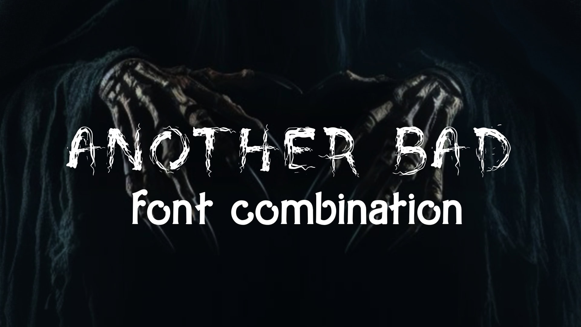
Hmmm, not so much. You see, too much contrast is not always a good thing. Here we have two utterly different fonts, fighting for attention. (This font combination doesn’t work not only because of the clashing fonts, but also because there is no hierarchy and no respect about the context. Keep reading for more details.)
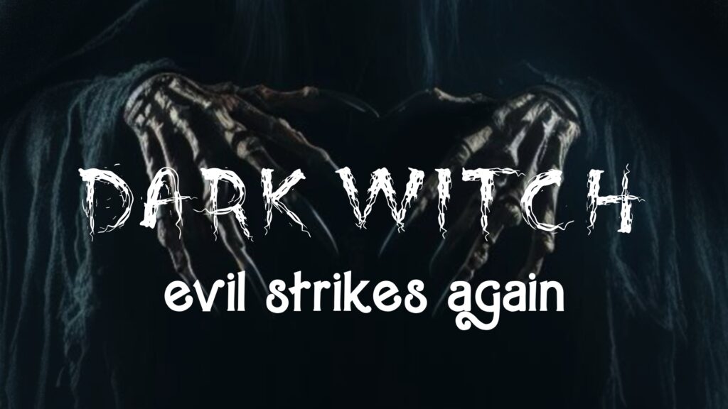
Instead of pairing the organic, witchy font with a cartoonish one, we can choose another organic font that is different but doesn’t clash so much.
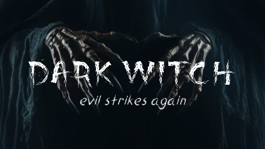
If you are already feeling overwhelmed, you can have the following “rule”: Try to combine fonts that differ to only one attribute.

3) Don’t forget about Context
It goes without saying that context (what the design is about) is fundamental to font-pairing. A promo banner that targets children as primary audience should be treated differently than eg a wedding invitation. When we deal with context, font combinations are important not only to make the design pleasing to the eye but also to make the design friendly to a specific target audience. (Marketing is a whole area of expertise that deals with this specific issue)
4) Hierarchy is important too
Hierarchy is the order we look at the different elements of the design. In other words, when pairing fonts we should consider which title is the most important and choose the most striking font for this one. Let’s take this banner for example.
At first glance there’s nothing wrong. Everything is done according to the rules, so we are good, right? Hmmm, again not so much. There is a problem with hierarchy, there are two dominant fonts fighting for attention, and the eye might get confused what to notice first.
The one below, although it is the same combination (a decorative serif font paired with an elegant, handwritten one) works better. Why? The answer is hierarchy. Here there is no doubt which font is the dominant one. Hierarchy is the unsung hero that can make or break a design.
5) Never pair more than 3 fonts (or should I say two??)
Since this is font pairing 101, here you have it. Never mix many fonts together. Chance are the design will be so overwhelmed, it won’t work. You might have seen intricate posters consisting of many many fonts but these ones are done by seasoned designers who know what they do. Design takes time, out of all the things I have done in my life (and believe me I have done way too many), design is the most difficult. Because a good design should be invisible. When no-one notices the design, it serves its purpose. When they start talking about it, something is wrong. (Just the same with mums! A good mum’s work goes unnoticed.:()
In any case, keep working, keep experimenting. Stick to the basics and don’t be afraid to … bend the rules. In time, everything will “click” together.
 Art discussion
 The future of Art (or why AI won’t take over)
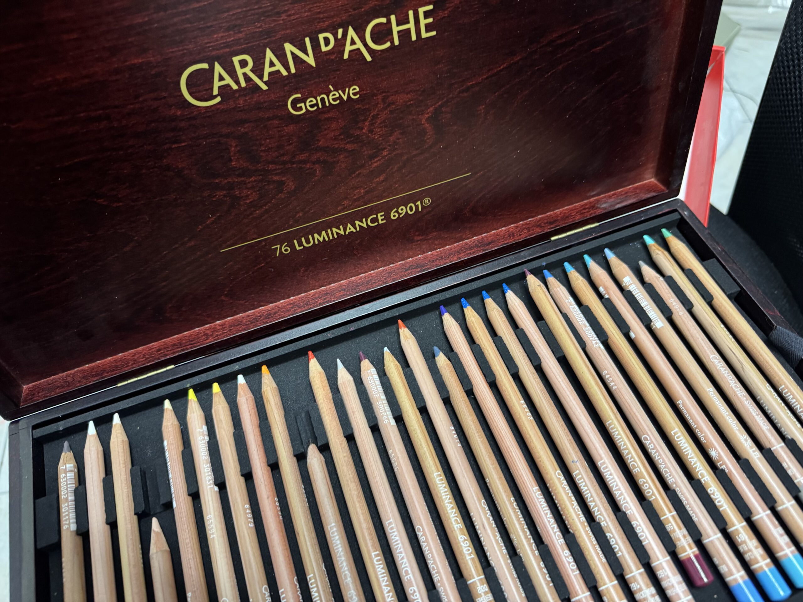 Colored Pencils
 My 5 top High End Artist Grade Colored Pencils
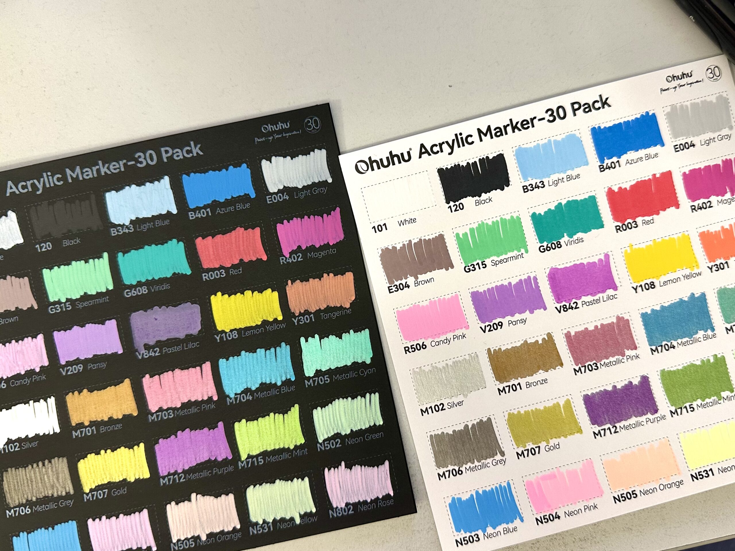 Acrylic Markers
 Ohuhu Acrylic Markers Review
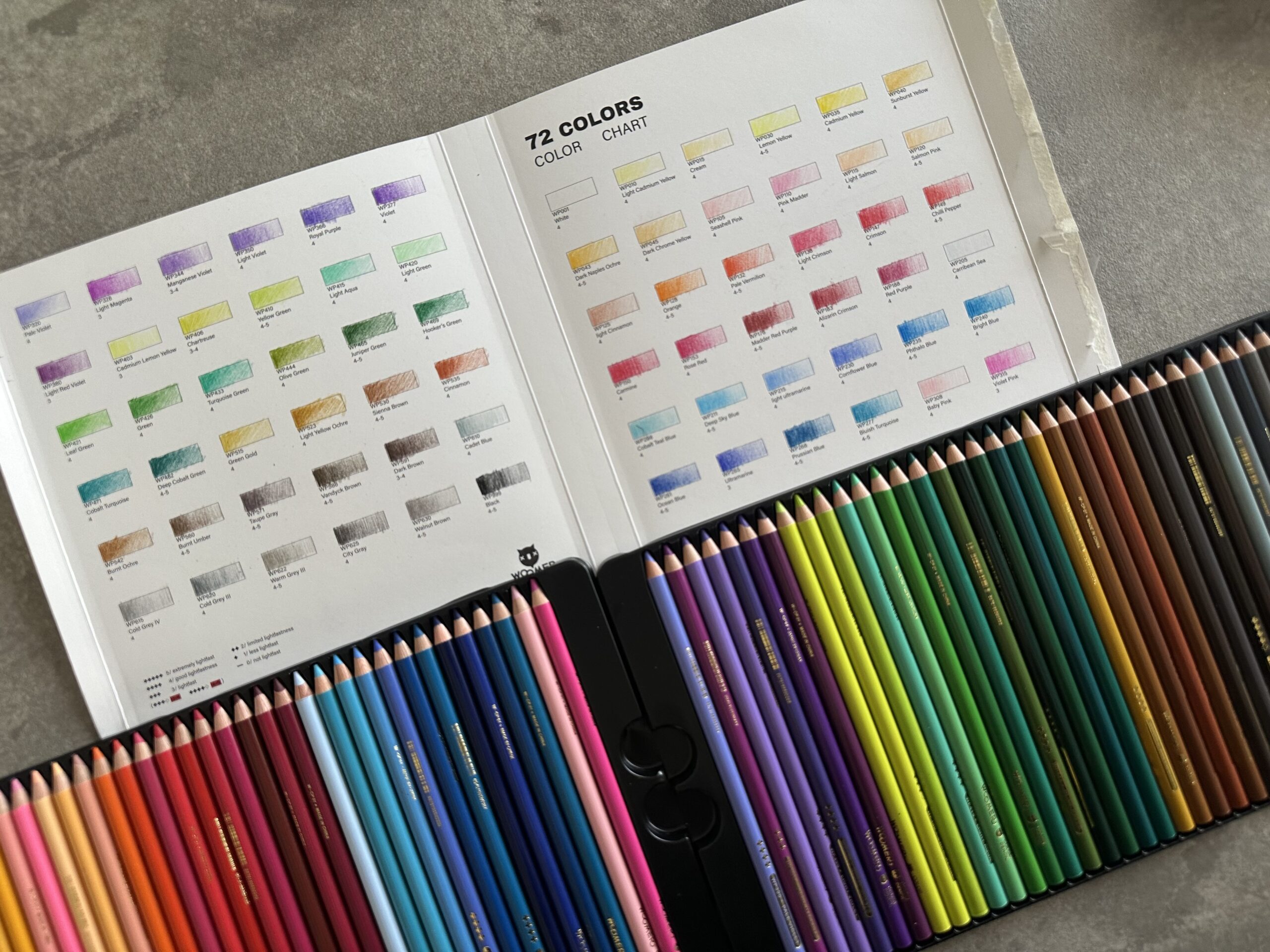 Colored Pencils
 Woomer Art Colored Pencils Review
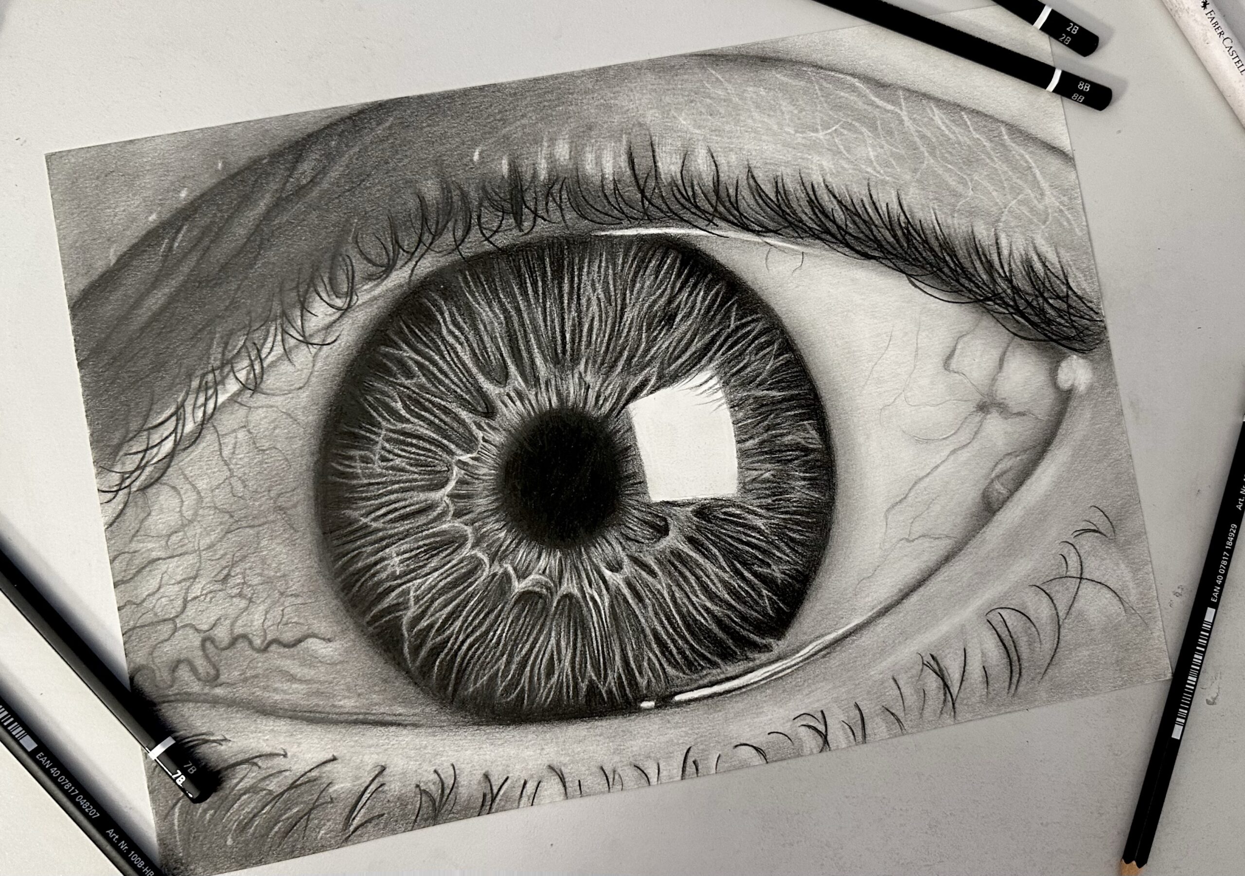 Graphite
 Staedtler Mars Lumograph Black Review
 Arrtx
Arrtx