When it comes to art, presentation is the key factor, and surprisingly no one seems to be talking about it! So, this post is about all of you, great artists out there who struggle with marketing their own art.
I, myself, (as many of you I am sure) made the same mistake when I was just starting out. I was spending all my time creating great stuff (well, at least I believed so! 😉 ) and left the presentation factor out. Meaning spending no time to market my art.
But, hello, we live in the internet era, if we want to make our voice heard, we need to stand out from the crowd. And this is where a good presentation comes in.
I cannot stress out enough what difference a good presentation makes, especially when it comes to art and design. Unfortunately I only realized it lately, when my career took a shift towards digital design. For example, you will see a font that looks great on a poster, you download it and realize that it doesn’t look as “WOW” as it looked on the poster. Because the artist has enough marketing skills to “make” it look good, unfortunately it doesn’t come automatically. Cause, let’s face it, nowadays there are many great artists, many great works of art, many alternatives to choose from. Presentation is the only way one can stand out from the crowd.
And don’t tell me the old story “I won’t spend time on presentation because it is cheating, I will show my real art to the world”. For too long I refused to spend time on presentation, only to realize (unfortunately after too long) that presentation is part of the art too.
And as a young designer I am nowhere near where I want to be, but I am slowly learning, and I am determined to show young artists what difference presentation can make. So that you won’t be doing the same mistakes I did in the past.
Let’s see part of my presentation process, so that you will have a better idea what I am talking about.
This is my latest font. Raw, as it looks when I type something and save it as an image.
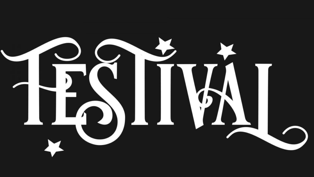
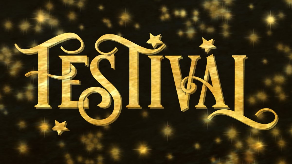
Looks ok, right? A cute font but nothing special. Since it’s supposed to be a “festive” font, (after all, the most wonderful time of the year is round the corner!) I decided to add a gold foil texture. Here you can find details how I did this. And this is the the result.

Much better, no? However there’s still something missing. Some letters are overlapping, so I draw on top of them to make them clearer.
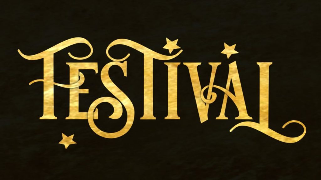
Background next, to make the font “pop”, since it looks quite bland and flat. This is probably the trickiest step for me. When it comes to the background, I feel lost. I don’t know how to proceed, there are too many choices. I ended up adding random “stars”, after all it is supposed to be a “sparkly” font!
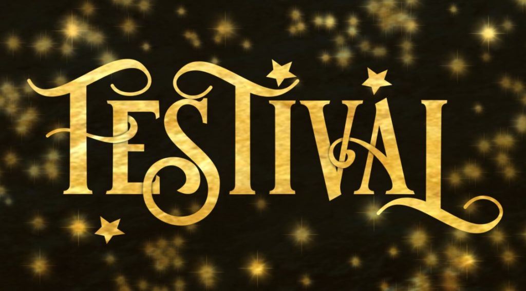
I would have stopped right now, but my husband (it’s always a good idea to have someone else look at your work, they can be more objective) pointed out that it looks flat and boring. So I duplicated the font layer, adding a 3-D effect, although I don’t think this is what he had in mind. 🙂

I could go on forever. As I mentioned, only recently I stsrted to appreciate a good presentation. But the key here, is to know when to stop. So this is it. With just a few clicks, a simple font was presented in the most sparkly way possible!
If you (just like me) want to make the most out of your art, these are the steps you need to take RIGHT NOW. Stop procrastinating, telling yourself: “I will create a lot of stuff first, market it later.” These two things need to happen simultaneously.
1)Make time in your calendar for your marketing strategy. A LOT of time. I have read somewhere (unfortunately I cannot recall my source) that creating should take 5% of the time and marketing should take the remaining 95%. Even for me, this sounds insane, but you get the point.
2)You should see the presentation of your art as a piece of art itself. Not something boring. Your work must have character. Stop being lazy and begin your research to find the best way to show it to the world!
3)Social media are your friends. No matter how much you hate them (I do too), use them wisely. Try the platforms and choose the right one for you. Be consistent with your content. If you love what you do, the world will love it too! Sometimes sooner, sometimes later. Being honest and consistent is the key.
4)Learn from the best. Look at your fellow artists who are successful in your field. How do they showcase their work? Research them, find one whose work and presentation you love, and try to showcase your work in a similar manner.
These are my tips I learned over the years, and I wish I knew earlier. But better late than never, right? 😉
Did you like this article? Share it!

Ioanna Ladopoulou
I am a designer and illustrator and I love everthing creative!
You should know that I cannot live without coffee. So, if you enjoy this blog, consider fueling me!

