
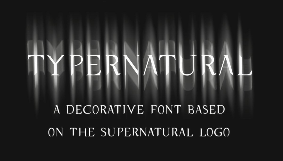
A simple and quick, but also useful tutorial on how to create a “Supernatural” text effect in Procreate. I am talking about this one:
Here is my Procreate workflow:
1. Choose your background
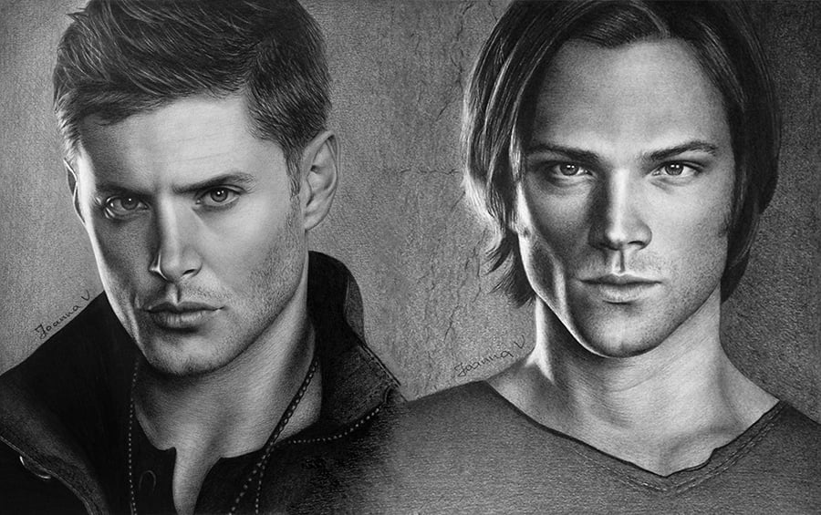
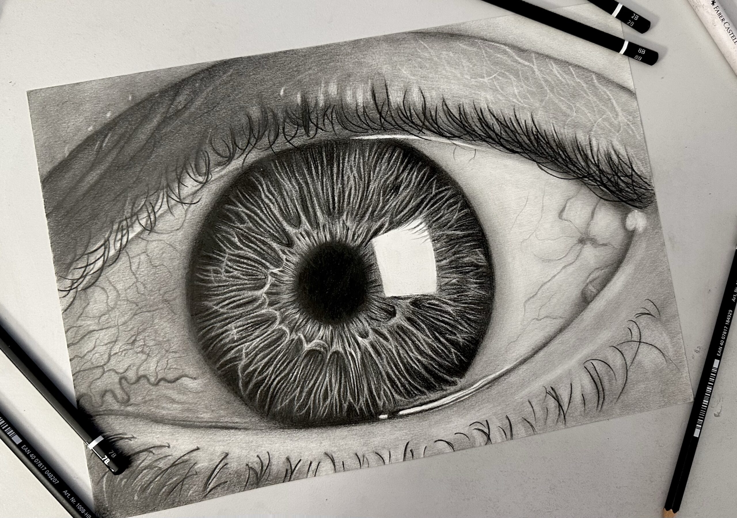
It can be a simple one-color background or a complex illustration. Since we are talking about “Supernatural”, I chose a digitized version of my older traditional pencil drawing:
2. Add the text
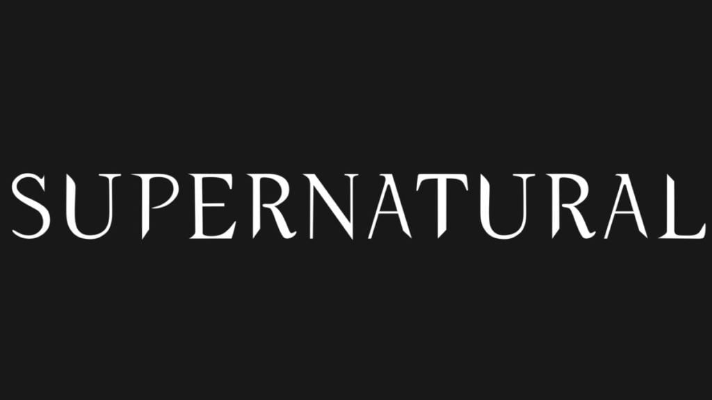
Select a font you like (you can use mine) and insert the text into the Procreate file. This is what my text looks like:
Since I do 99% of my work on an IPad, (and I believe you do too, if you are reading this tutorial!) my photos have all backgrounds, ergo a black one. All it needs is the right blending mode.
Extra tip: Practice blend modes!!! There is nothing that cannot get fixed!!!
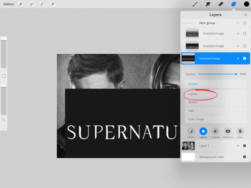
I choose the layers button -> Lighten -> Lighten. Note that depending on the background color, or the text color, or the effect you’d like to achieve, you might need to use another blend mode. Just practice with them! 🙂
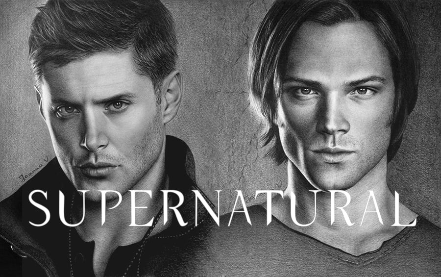
The final result should look something like this:
3. Tweak the text to your liking
What I like most about Procreate is that, unlike photoshop, it is so so so easy to use. There is only a limited amount of buttons/choices, that the user can find instinctively, and the best part: 99% of the work that is done in photoshop, can be done in Procreate too! It just might need a few extra clicks.
Anyway, what I do at this point is duplicate my text layer. Then I go to adjustments -> motion blur and drag my Apple Pencil (or my finger) across the screen, towards the direction I want the effect to be. Just practice with it until you get it right.
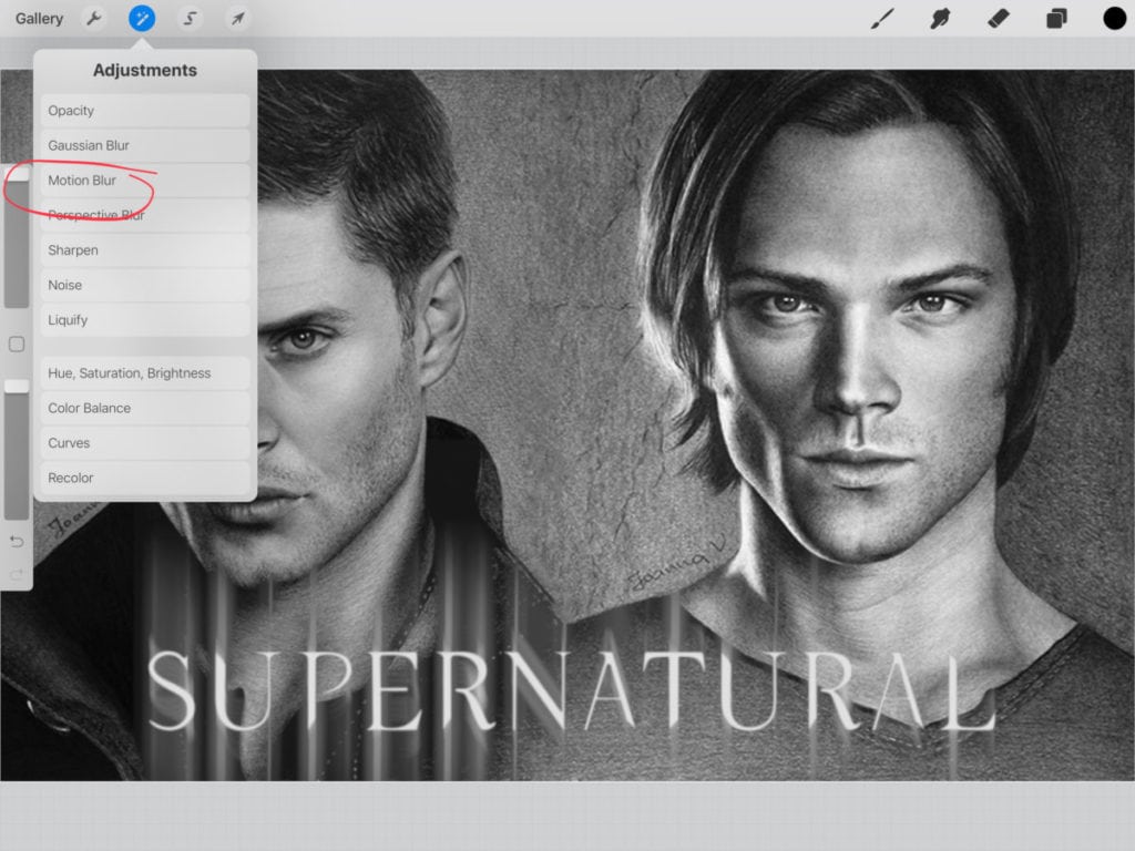
Depending on the intensity of the effect I want to achieve, I sometimes play with the opacity of the layer or duplicate the layer and do the same process (adjustments -> motion blur) until satisfied. The finished work looks something like this:
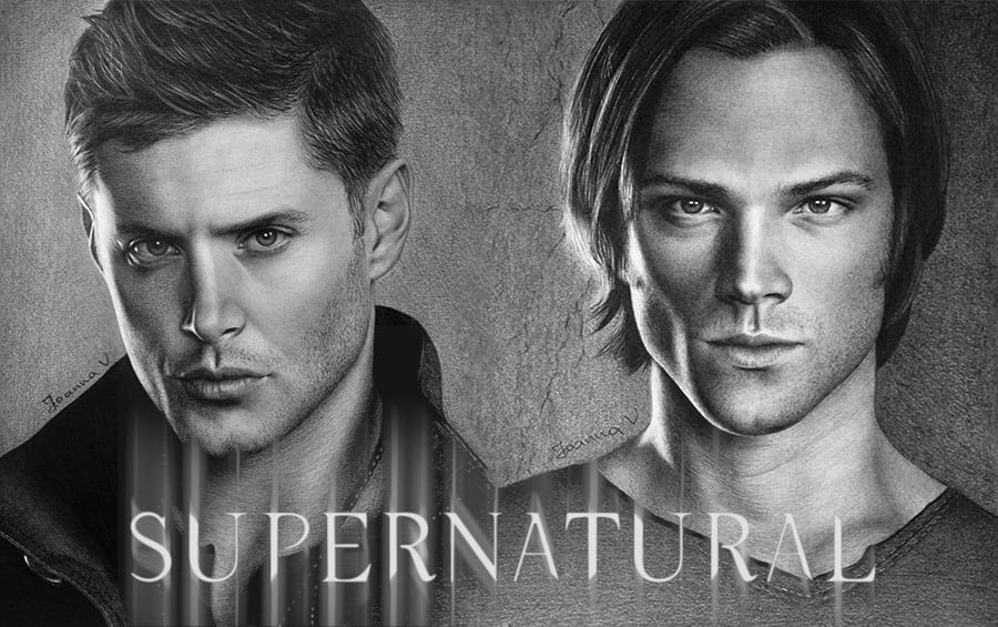
So, here you have it! Professional design work, with just a few clicks and the comfort of your iPad!
 Art discussion
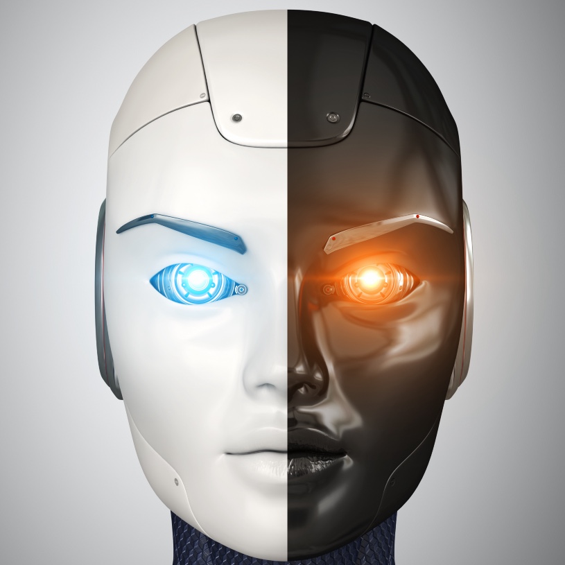
 The future of Art (or why AI won’t take over)
 Colored Pencils
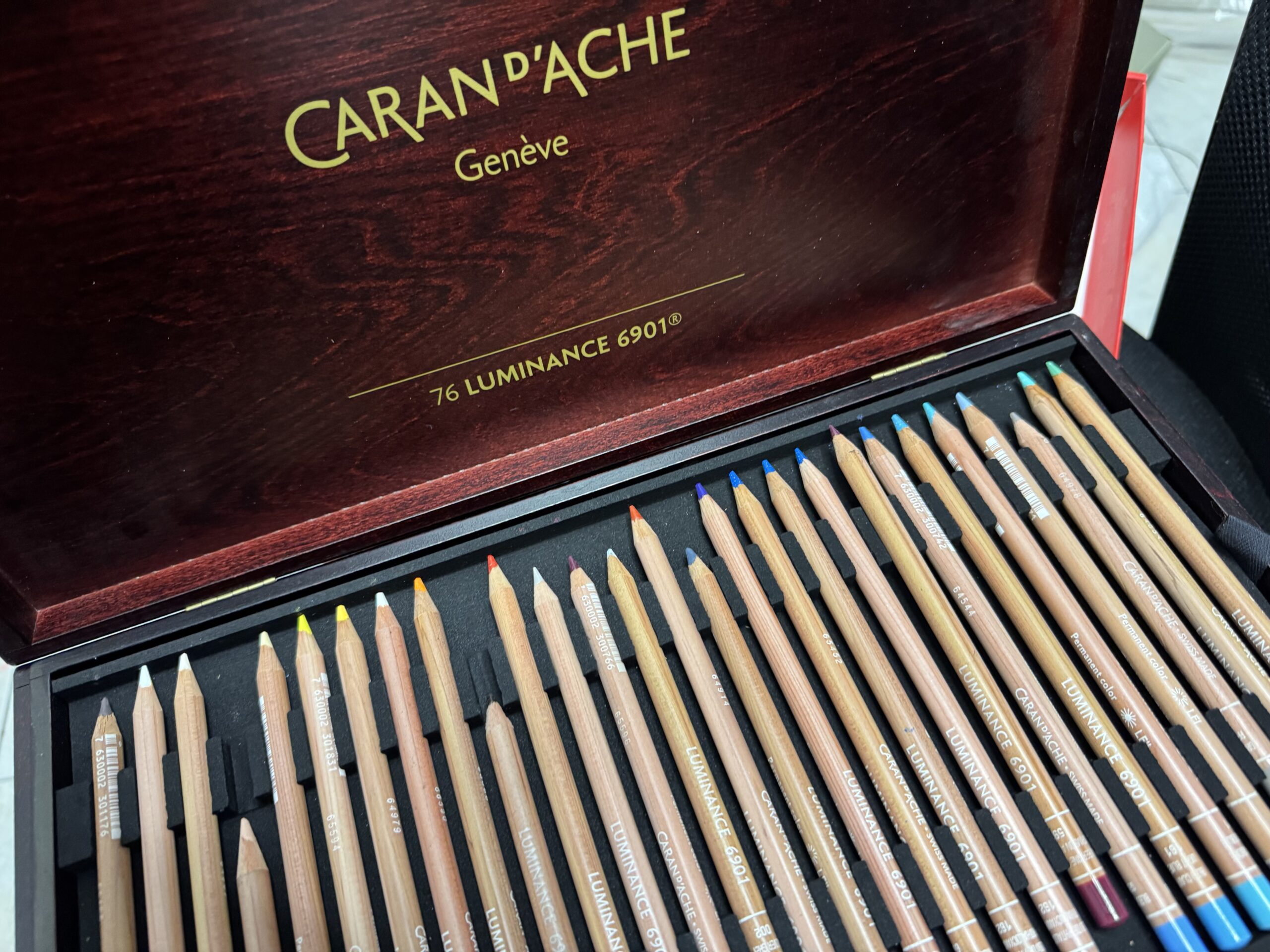
 My 5 top High End Artist Grade Colored Pencils
 Acrylic Markers
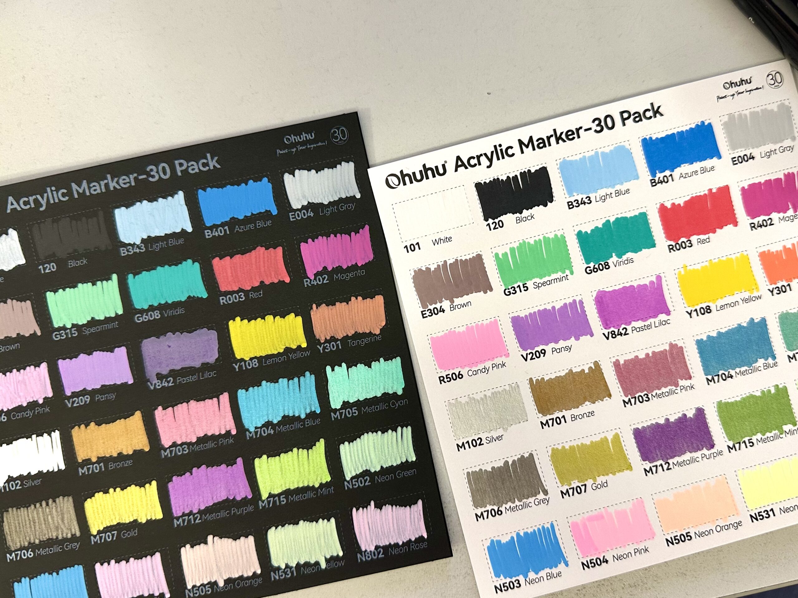
 Ohuhu Acrylic Markers Review
 Colored Pencils
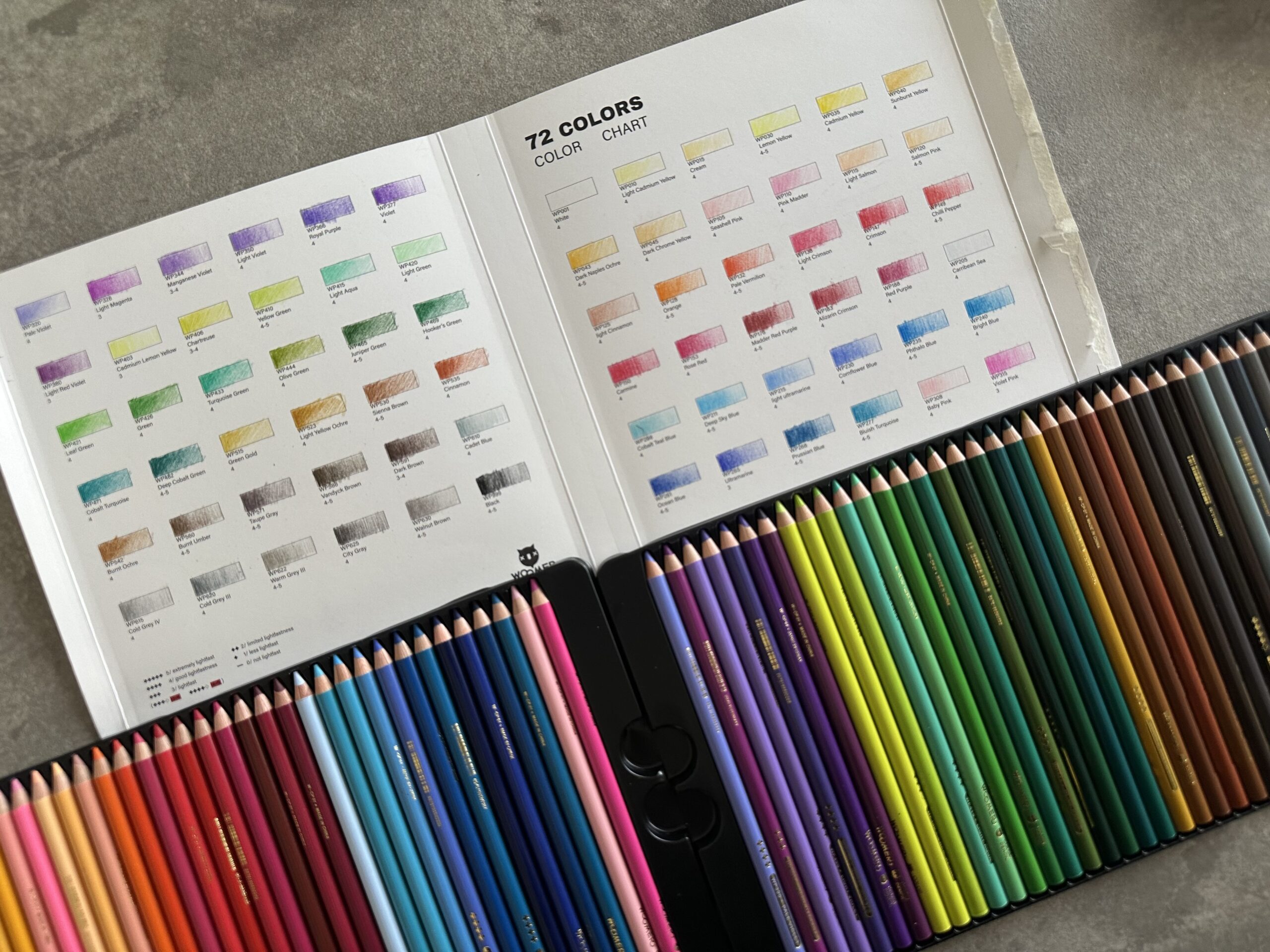
 Woomer Art Colored Pencils Review
 Graphite
 Staedtler Mars Lumograph Black Review
 Arrtx
Arrtx