
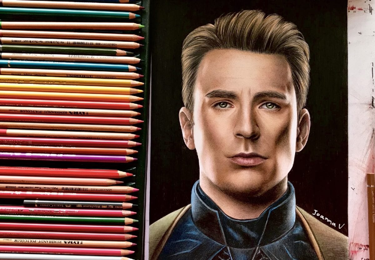
Started this Captain America drawing the other day. I wanted so much for this to be my best work (or one my best works) but sometimes things don’t go as planned. I had mixed thoughts about posting this piece on the internet, but in the end I decided to share it. After all it is part of my journey! And if you are following me, you must have realized by now that I am honest as hell when it comes to my art, I never sugarcoat anything. So here is the piece I am not proud about! Let’s break down what went wrong with this Captain America drawing!

1. Tools
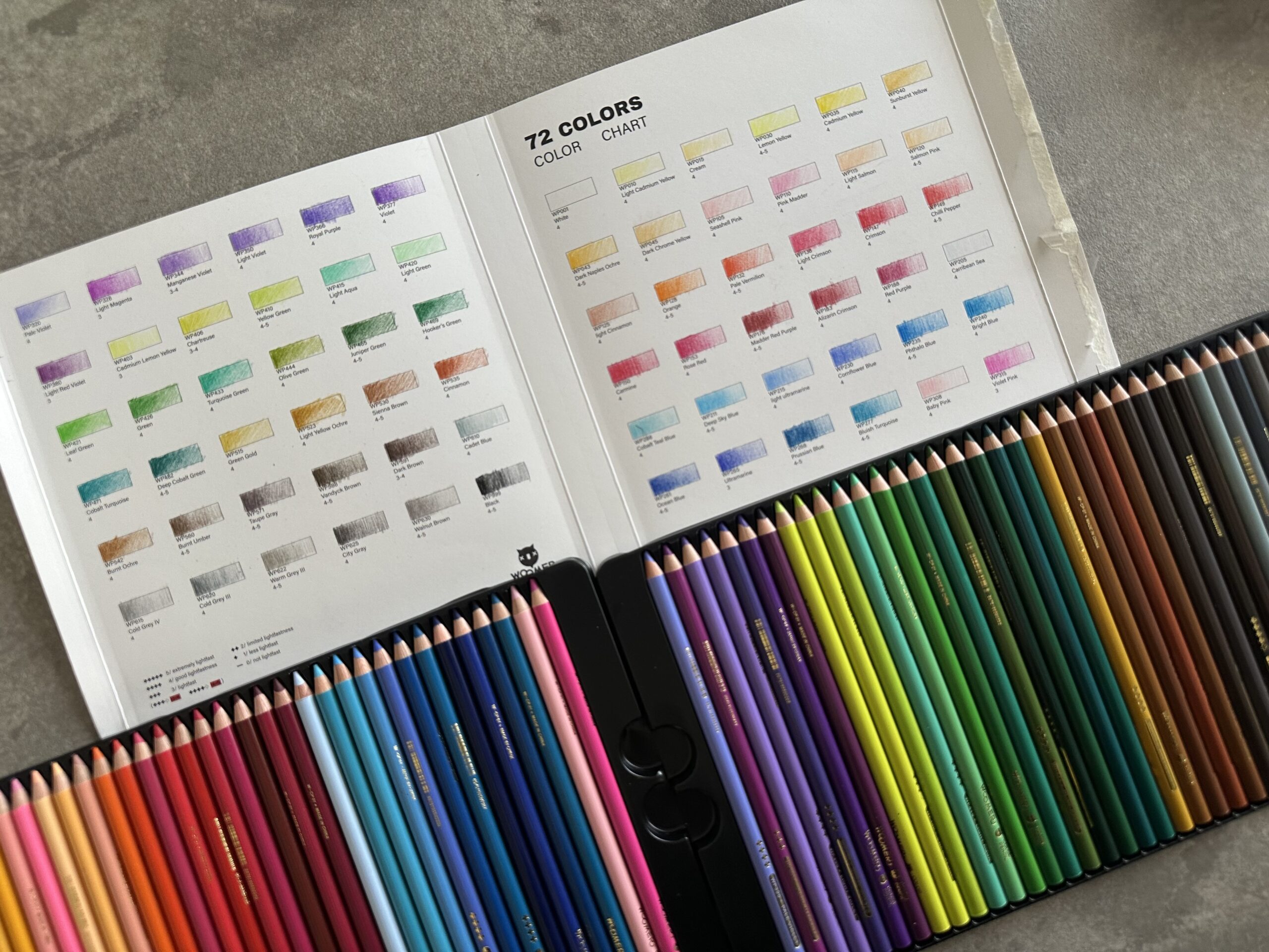
Part of my “failure” was the super crazy selection of colored pencils. I pretty much used all shades of brown I own. (Funny thing, I always advise others to use as few colors as possible for the sake of consistency. Next time I will make sure to follow my own advice)
So many different hues, if not used correctly, can lead to color inconsistencies, potential plasticity, a quality close to that of the “uncanny valley” and lots of other minor problems. Anyways, here’s a complete list of the materials I used:
- Fabriano multipaper 350gsm
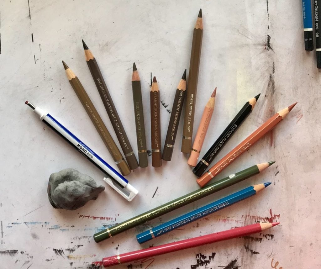
- Colored Pencils: raw amber, van dyke brown, nougat, burnt sienna, walnut brown, bistre, cinnamon, black, sanguine, chromium green opaque, bluish turquoise, burnt carmine. All Faber-Castell polychromos or Albrecht Durer (Whatever is readily available at the local bookstore!)
- tombow mono zero pencil eraser
- putty eraser
- random sharpener (not shown in the picture)
2. Poor choice of reference image
Remind me not to draw another face looking strictly straightforward. Like they say “there’s nothing more difficult than drawing the … other eye”. Total symmetry is never a good thing, especially when drawing. Just a mm off center and the face becomes someone else’s.
3. Too much attention to technical stuff
As mentioned before, I wanted to create something special and I got so lost to the technical details, I lost the point of the drawing. Instead of capturing the subject’s soul, I tried to make the skin as flawless and as smooth as possible, make the colors as close as possible to these of the reference image (thus the huge selection of browns described in 1.) and generally I treated the artwork as a strict study and not as an actual artwork.
Lesson learned. I plan to draw this exact portrait again in the future, following my own advice this time! We’ll see how it turns out!
 Colored Pencils
 My 5 top High End Artist Grade Colored Pencils
 Acrylic Markers
 Ohuhu Acrylic Markers Review
 Colored Pencils
 Woomer Art Colored Pencils Review
 Graphite
 Staedtler Mars Lumograph Black Review
 Arrtx
Arrtx Arrtx 60-piece Regular and Anime Acrylic Markers Review
 Art discussion