

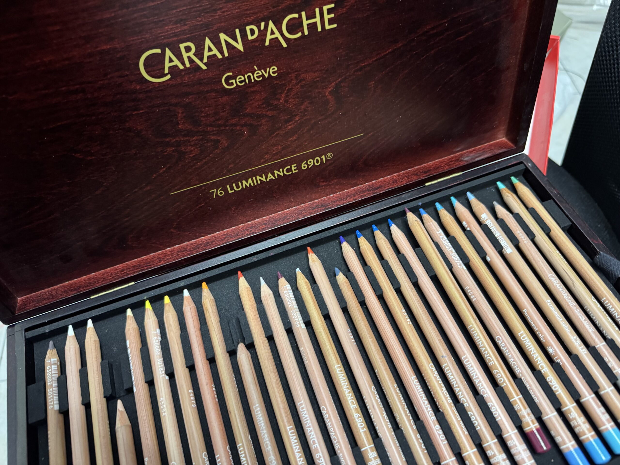
So, here’s the deal. After a long (1-year long) break from Caran D’Ache Luminance colored pencils and from traditional drawing in general, I decided to give these pencils another chance.
Because I initially wasn’t impressed. The most annoying part was that everyone on the internet was raving about them, but I just couldn’t make them work, no matter how hard I tried. (Mind you, I didn’t try THAT hard, I actually only did a couple of artworks using Luminance. However it shouldn’t be that difficult to get the grasp of them, they’re just colored pencils after all…)
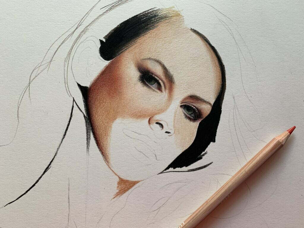
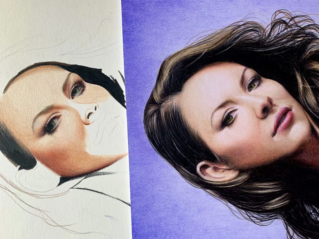
Anyways, I recently was commissioned to draw the ever-so-fabulous Evangeline Lilly. Because of luminance’s superb lightfast qualities, and because a year passed and I had forgotten how it felt working with them, I decided to give the pencils another go.
And nothing seemed to work.
Funny thing is that I love everything about luminance: I love how they feel, I love how the pigments is layered on paper, I love the opaque vibrant colors. The only think I don’t love is the … final result.
Texture, texture, texture
For some reason luminance looks way too gritty for my taste. That is kinda expected of soft wax-based pencils, but this is the first time I see a pencil create SO MUCH texture. Even for total weirdos like myself who love heavy texture, luminance looks way too grainy. Sure you can blend. But 1) I hate blending 2) blending can make your drawings look patchy at places 3) glare is so much, it is almost unbearable to the eye. XD
Layering
Another issue with luminance is that I cannot layer many colors, especially on smooth paper. I feel that after a couple of layers, my paper cannot hold any more pigment. Once again, soft wax-based pencils tend to deposit more product on paper (just with a single layer, the color is super bright and saturated) but personally I want to be able to lay down as many color layers as I want. (generally I prefer to work with a limited color palette and countless layers, I find this method more precise than using countless, unrelated, different pencils)
… and a random disadvantage
I cannot keep the pencils sharp. The lead gets blunt REALLY quickly. For a control freak such as myself… that’s not good, I need to sharpen them all the time. Subsequently I have to restock used-up pencils all the time. Not convenient, especially considering the ridiculously high price tag.
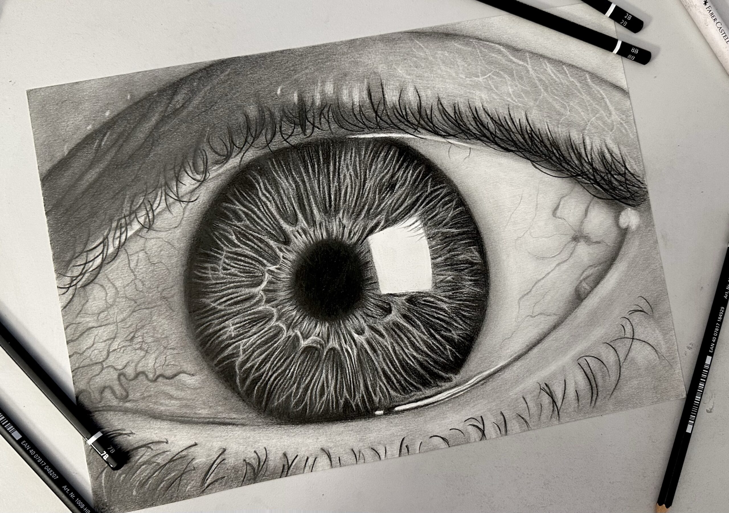
In short… I scrapped the original drawing of Evangeline Lilly. And started fresh using my favorite pencils of all time faber-castell polychromos. I guess you can see the difference.
DISCLAIMER: So, yes friends, I just cannot make luminance work for me. Don’t get me wrong, they are superb pencils. But considering the hype around them and the ridiculously high price tag, I expected them to solve all my drawing-related problems. XD Which is a reminder that one shouldn’t rely on materials so much. Constantly striving to improve your skills is more important than hunting down the “perfect” pencils, paints, software, you name it. A pencil won’t make you draw better. (Unfortunately!) In any case, if you are curious about my favorite materials, you can find them here.
 Art discussion
 The future of Art (or why AI won’t take over)
 Colored Pencils
 My 5 top High End Artist Grade Colored Pencils
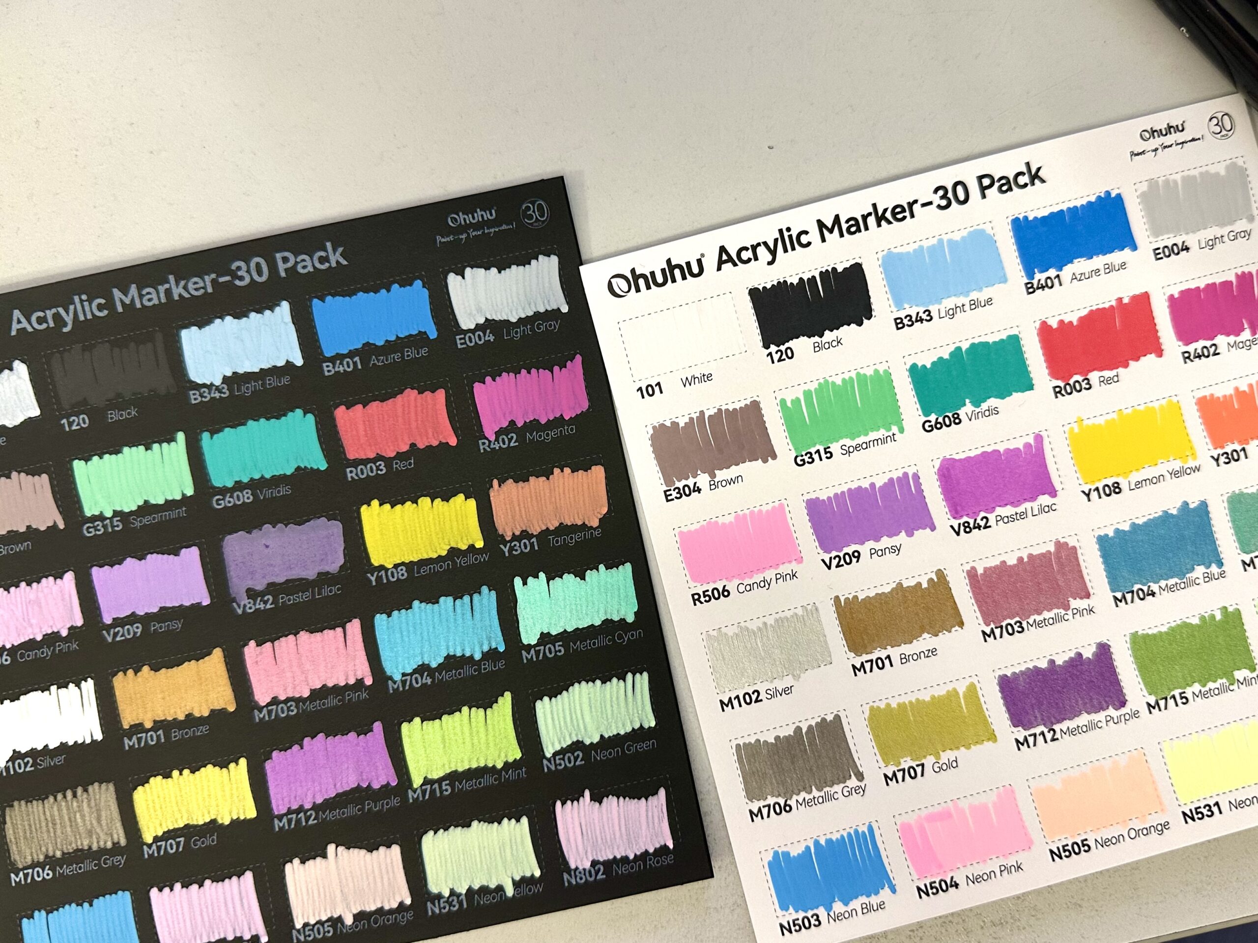 Acrylic Markers
 Ohuhu Acrylic Markers Review
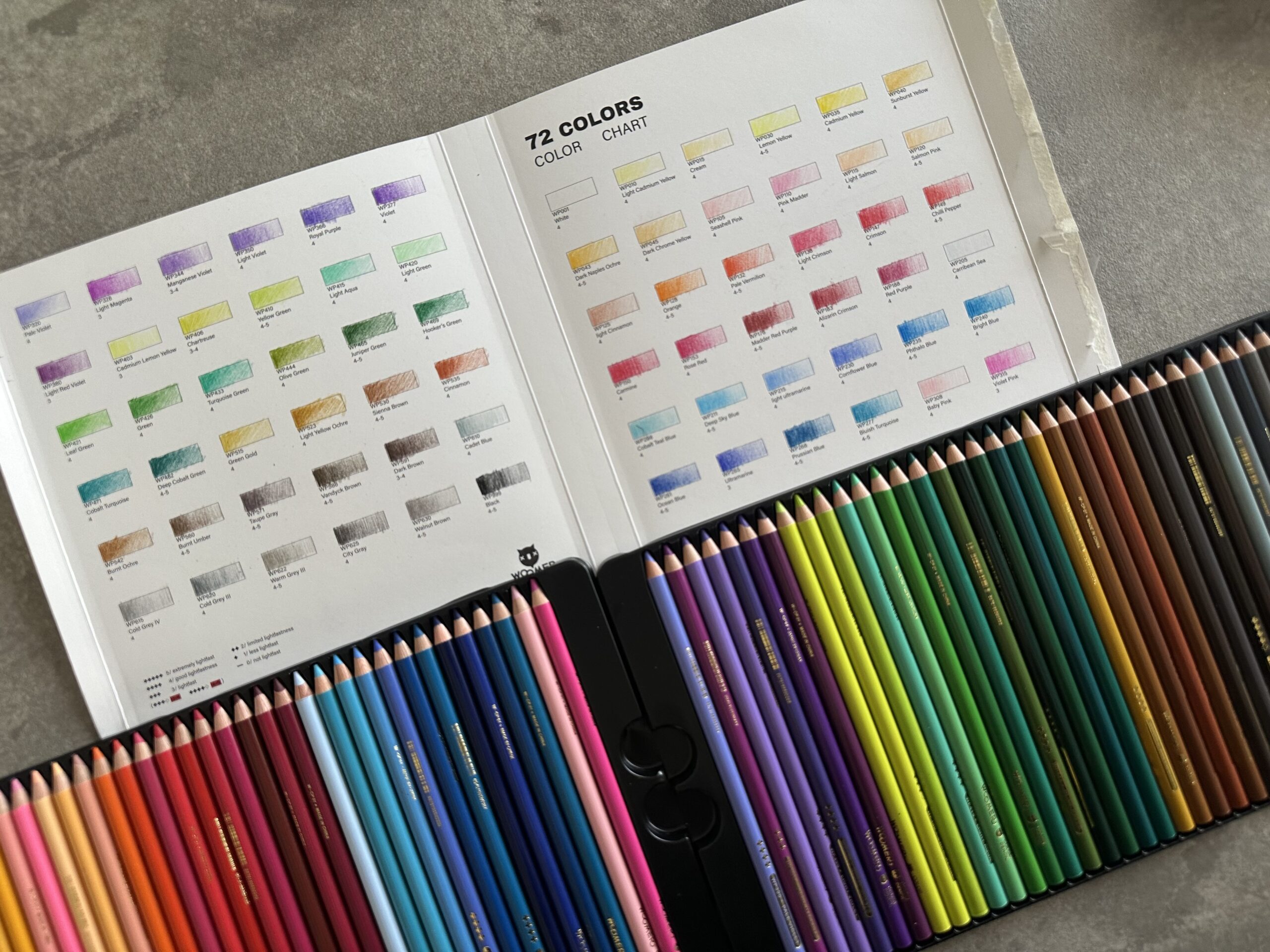 Colored Pencils
 Woomer Art Colored Pencils Review
 Graphite
 Staedtler Mars Lumograph Black Review
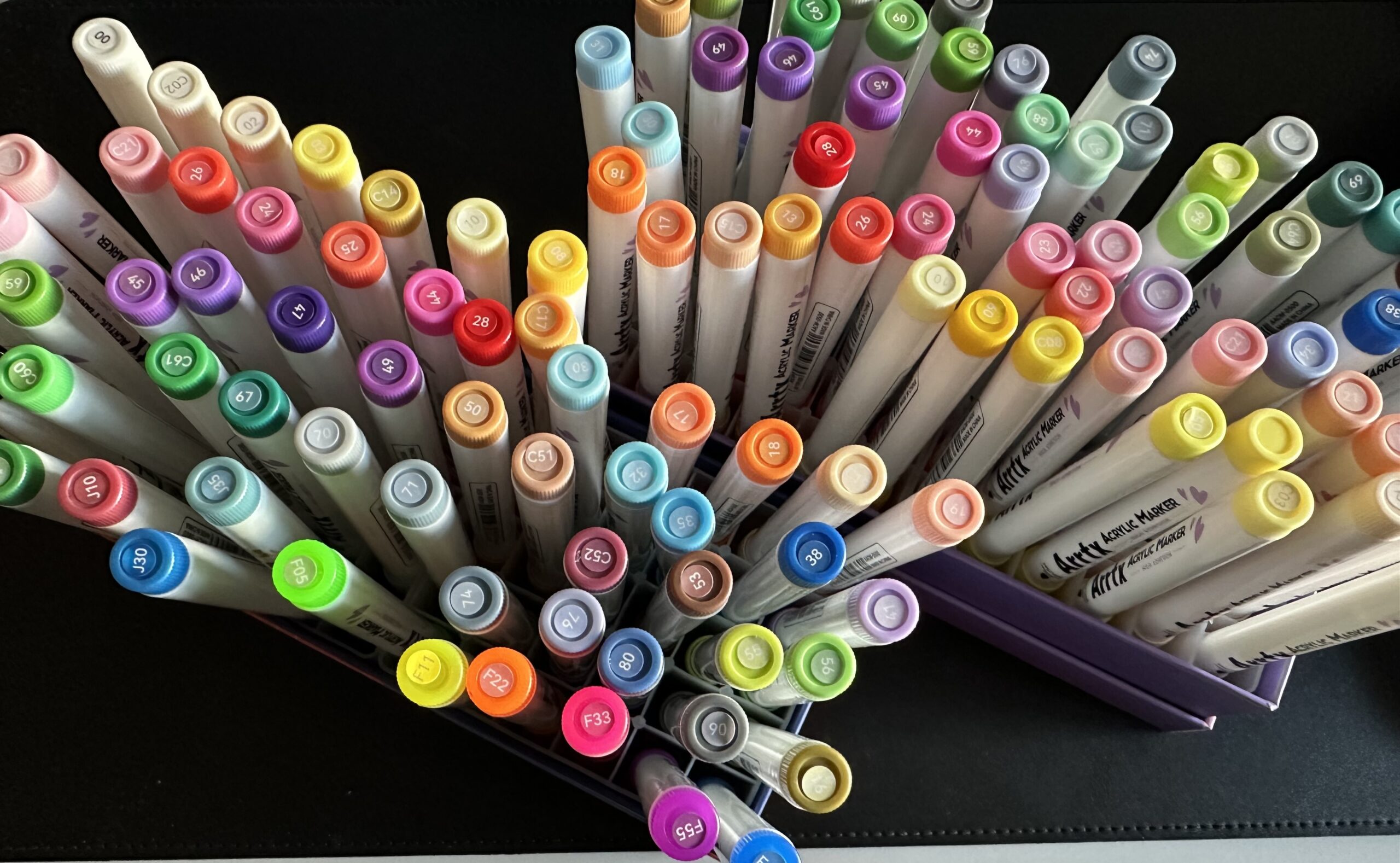 Arrtx
Arrtx
3 Responses
I have most of the Polychromos pencils, most were bought about 30 years ago plus a few bought recently. The old pencils work good as new. They have a fabulous color range, there is a great range of greens for foliage and blues for skies and seascapes. It could do with more darker colors and some browns feel a bit too transparent. Some colors very similar and could be skipped, it would be nice if Faber Castell swapped them for more muted earthy colors as the selection is weighted heavily towards the bright tones. These firm core is excellent for layering – using multiple light strokes to build up colors. They are too hard for blending – where you push bits of pigment into other layers to create a new color. A disadvantage is they smudge easily – colors drawn in a sketchbook will rub onto the opposite page.
I also have many Derwent Lightfast pencils. In some respects they are like a softer Polychromos. They are nice to draw with. The colors tend to be more opaque and earthy. There are some outstanding colors but the selection is patchy, for example many orange-browns, medium-dark blues, light greys, and dark desaturated colors. There is no lemon yellow or dark grey, only one blue suitable for skies etc, which is disappointing in a premium set like this. I added some Derwent Coloursoft pencils (all lightfast) to fill in some gaps. They are much more resistant to smudging than Polychromos.
I recently bought most of the Caran d’Ache Luminance pencils. These have a very different feel from the Polychromos . They don’t layer as well, building up quickly to a glossy waxy, almost plasticy layer which doesn’t accept more layers. They work well if you go in with just a few heavier layers. Being wax based they blend better – drawing a color over the top will drag and blend some underlying color which can be useful – Polychromos don’t work like this. The color selection is good but probably too many brownish colors and could do with more greens. These pencils are very resistant to smudging – I have not observed the colors rubbing off onto the opposite page in my sketchbook.
I agree with you–the Luminance pencils just do not warrant their high price.
Caran d’ ache needs to bring back Supracolor I pencils back into production. There are effects I just have never really gotten since they went out of production.
I still have a small stash of Supracolor I russet-colored pencils I am saving for something special.
Exactly, I couldn’t phrase it better!
I haven’t tried Supracolor but oh my Gosh, I am now intrigued. It seems to me that brands are all about money lately, no care for the actual customers/artists. 🙁