

There’s no denying that Comic Sans is one of the most popular, most overused fonts out there. There’s also no denying that Comic Sans is probably THE most hated font out there. And even thought the subject has been extensively scrutinized over and over again, I wanted to add my own voice. (From a designer’s point of view)
A little backstory first, so that we can understand how the font was inspired and how it became so popular.
Comic Sans was designed by Vincent Connare and was initially intended to be used in the talk bubbles of a program called Microsoft Bob. The font wasn’t completed in time to actually make it into the program, but it was later released with Microsoft Windows 95, and the rest is history.
But how it became so popular?
Comic Sans is fun and simple
Unlike most 90s fonts, Comic Sans is on the “funny” side – not overly “formal”. We have to understand that when Comic Sans was released, things were not the same as now, type-wise. I got my first pc in the early 2000’s and back then fonts were not a big deal like they are now. Most of the time we would use the fonts that came with the pc operational system and believe me, there was only a handful of them. If we wanted something strict and serious we would use Times new Roman or something similar. If we wanted something less serious we would use Comic Sans, practically no other options. As you can tell, Comic Sans was very popular when it came to things like party invitations, announcements, student resources and basically everything not-so-formal. All my practice sheets from my school years were written in Comic Sans.

It is organic, handwritten
Back in the 90s – 2000s, this was a big deal. As mentioned before, we only used the fonts that came with the system, all of which were “perfect” (think how aligned and pixel perfect are Times New Roman or Arial). Comic Sans was the only handwritten font, that stood out from the lot. This handwritten quality together with the fact that it looks funny and friendly contributed to being particularly popular among students, teachers etc
It is free and readily available
Comic Sans was and still is 100% free, which contributed to its great popularity. It comes with Windows and Mac operational system and it is easy to download and install. For those people who don’t wanna spend hours searching for the “perfect” font (sometimes we call them *ahem* designers, but in fact they can be anyone really!) and those who want to create something fast and call it done, Comic Sans is an easy and (most times) safe choice.

It is beautiful
Yes, people, it is a beautiful font! Everybody is talking about its imperfections, but guess what, nothing’s perfect. If it wasn’t for its massive popularity no one would pay attention. There are countless praised fonts out there which have the exact same issues as Comic Sans. Yet nobody criticizes them, nobody seems to care. Which brings us to…
Why is Comic Sans the most hated font out there?
It is overused
Way overused. So much, that it is used where it shouldn’t. As I mentioned before, Comic Sans has unique characteristics, thus became very popular. When I was a kid, all my teachers used Comic Sans on our homework sheets. A few (ahem) years later, my kids teachers still use comic sans. Teaching resources, cv templates, logos, comic sans is everywhere, to the point that it becomes boring.
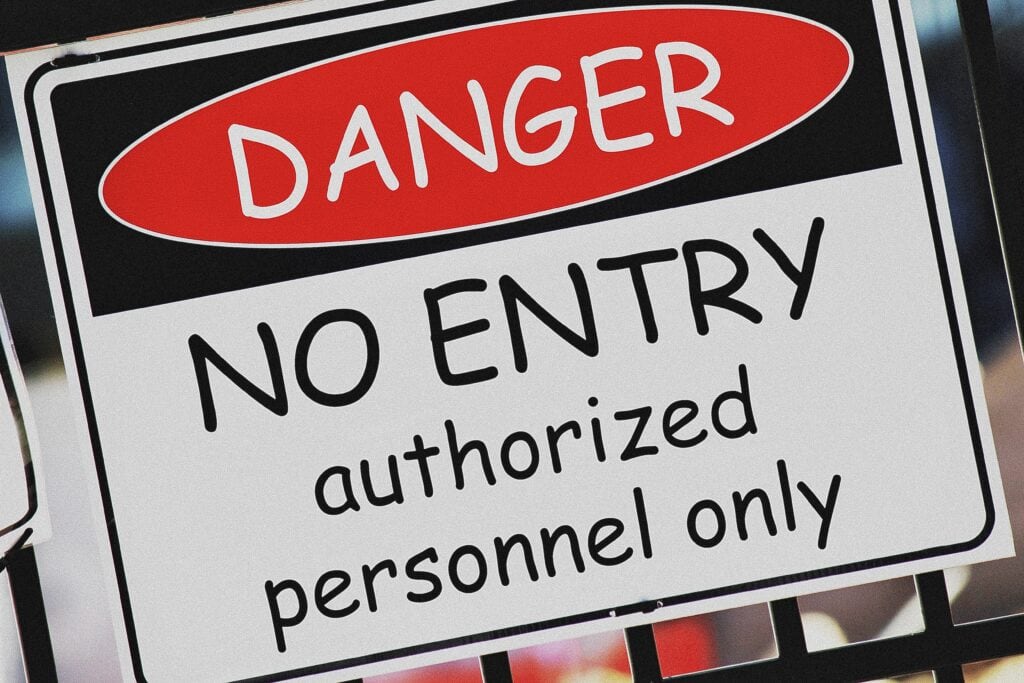
However it’s not just that. We ended up using Comic Sans where we shouldn’t. From a designer’s perspective, all fonts shouldn’t be used interchangeably. As much as I hate putting labels, (cause graphic design is art after all and it should be treated as such, promoting freedom and expression), you simply cannot use comic sans in eg warning signs, formal announcements, basically anything serious. Comic Sans has been abused so much, that is now being hated for the wrong reasons.
It has flaws, design-wise
From a design point of view, Comic Sans has characteristics that are considered ”bad”. (What is “bad” font-wise is another story, but let’s not elaborate on that for now.) The matter has been analyzed over and over again, you can check out this and this link, a couple of my favorite articles. True, it seems “faulty”, yet again every font is, if scrutinized and analyzed as much.
Back to Comic Sans for now. The font is supposedly handwritten, in monoline form (line weight is consistent throughout the whole letter), which makes certain letters look heavier at parts and lighter at some other parts. These heavy parts draw unwanted attention, making the font “inappropriate” for long test. But… guess what, Comic Sans was never intended to be used for long text in the first place.

Also kernings (the distances between two letters), are supposedly inconsistent. When it comes to typography, kernings are a story of their own. But since I want to keep this post as uncomplicated as possible, there’s a a simple way to illustrate what I am talking about. If we take the above image and flip it horizontally, even the untrained eye can detect variations between letter spacing.
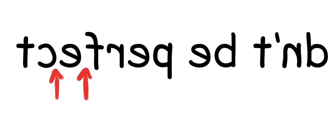
You don’t necessarily need to flip the image to notice that, however a text becomes ineligible when flipped, forcing us to notice all tiny details that we tend to dismiss normally. (Because subconsciously we pay the most attention to the text itself, to its meaning.)
So it’s true, Comic Sans has some inconsistencies/imperfections when it comes to design. But the thing is that ALL fonts have flaws. Below I am comparing Comic Sans to Gotham, another (not-so-famous) font, and before you start making comments, let me tell you that Gotham is one of my favorite fonts of all time.
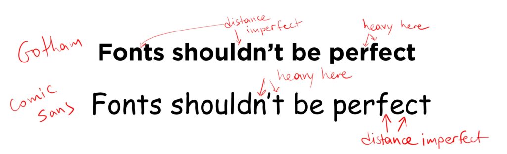
Personally, I see the exact same issues. But it’s Comic Sans that gets the hate, not Gotham. Why is that?
People tend to “protect the weak”
Subconsciously we tend to root for the weak and oppose the strong. When two football teams play against each other, and there’s no actual reason why to support one or the other, most times we support the one ranked lower. This is purely psychological and possibly has its roots to the Bible itself. What it means, however, is that we hate Comic Sans because it has become so astonishingly popular! No one would “hate” it if it was a font like all others. (Nobody hates my humble fonts, even though they do have issues!)
So? Final thoughts?
As mentioned, no one expected Comic Sans to become so popular. Jeez, it was only supposed to be used in talking bubbles! Graphic design is art, it is self expression, and everyone should be free to use any font. However, a small warning: Because Comic Sans is so overused and recognizable, please stop using it blindly. You give font a bad name. 😉
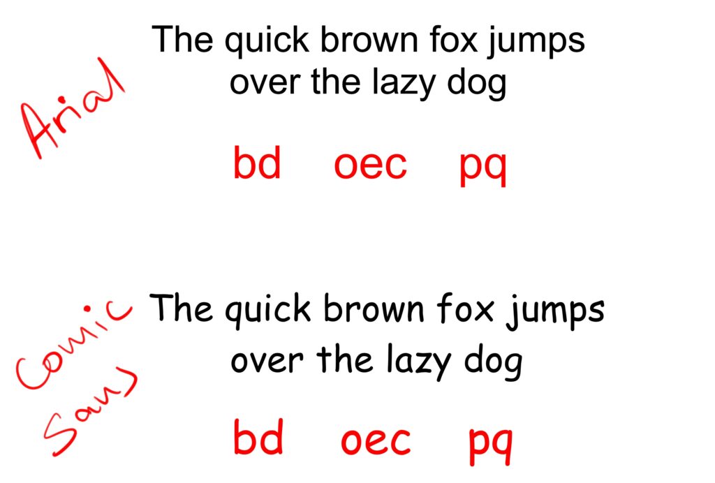
PS: There might be another reason why Comic Sans got so popular. It is supposedly dyslexia friendly. The idea is that each letter is distinct and different, whereas in most fonts letters are constructed by flipping, repeating or using parts of other letters.
Although it kinda makes sense, I couldn’t find any valid research online that Comic Sans is indeed suggested for dyslexics. As a former phd candidate (and later a phd dropout, but that’s another story) I need proof before accepting a fact. Although no such proof exists, the argument is pretty convincing. Hmmm it would be interesting to do my own research if I can find enough speech therapists willing to assist. Keep checking out this space! 😉
 Art discussion
 The future of Art (or why AI won’t take over)
 Colored Pencils
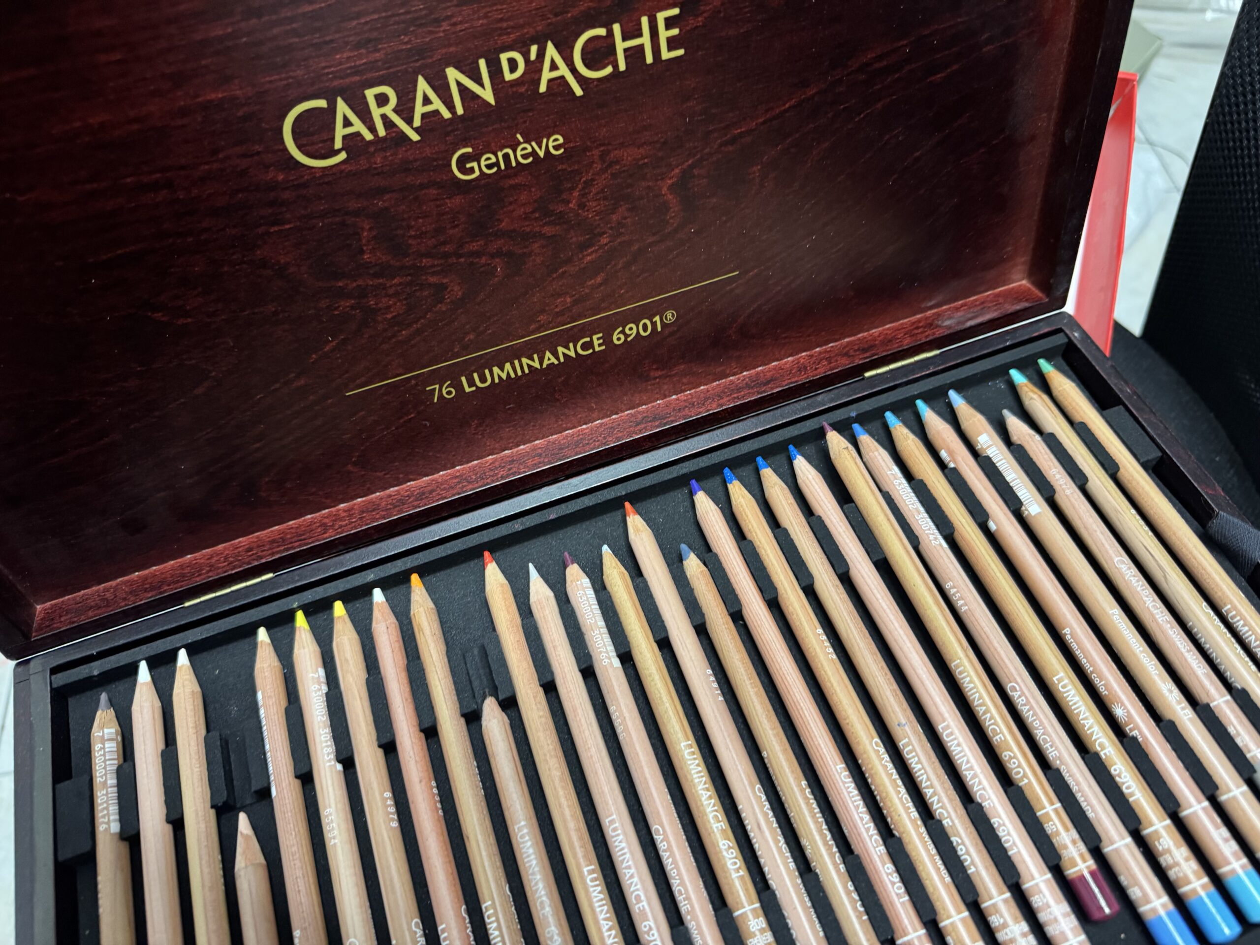
 My 5 top High End Artist Grade Colored Pencils
 Acrylic Markers
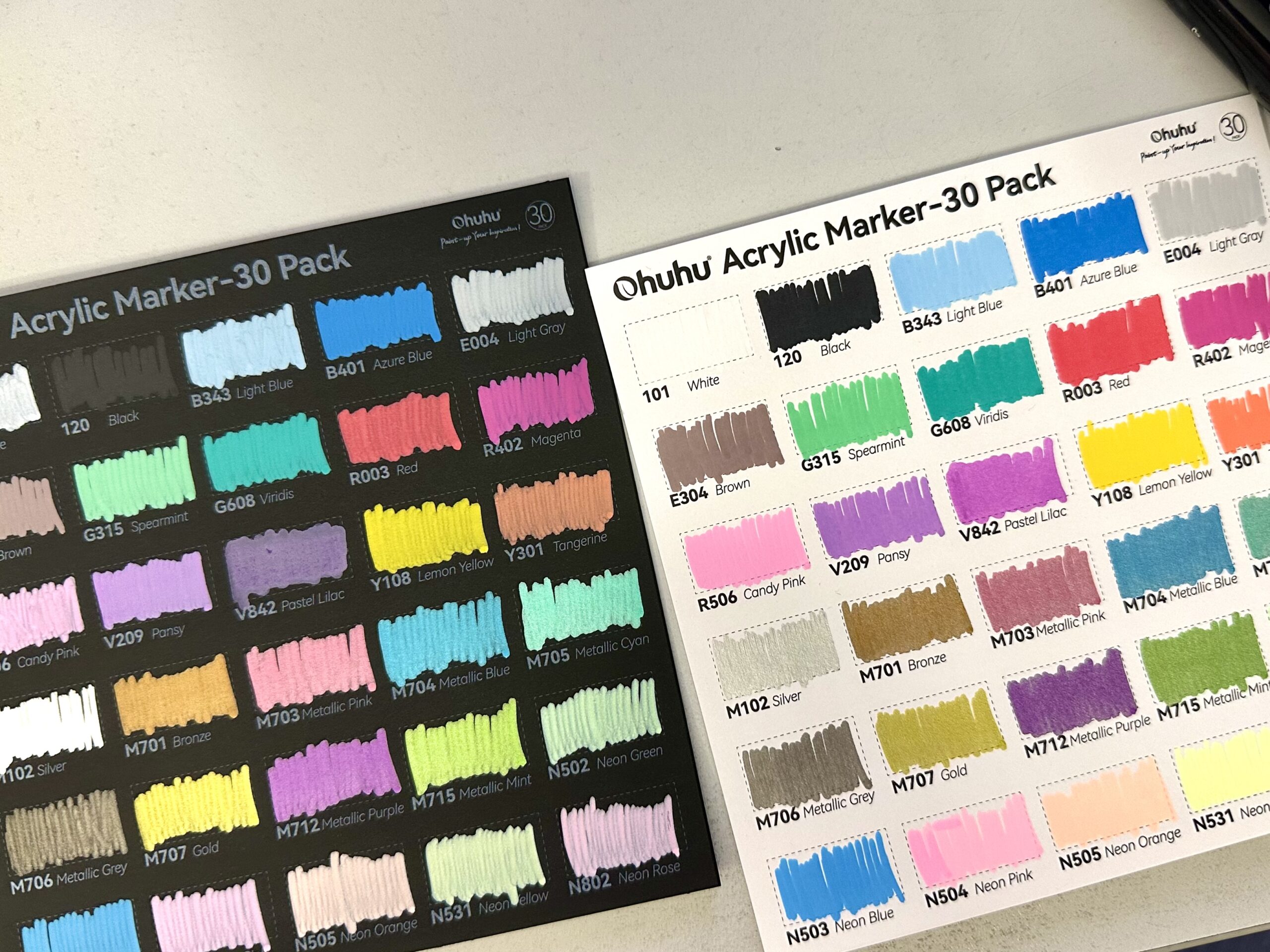
 Ohuhu Acrylic Markers Review
 Colored Pencils
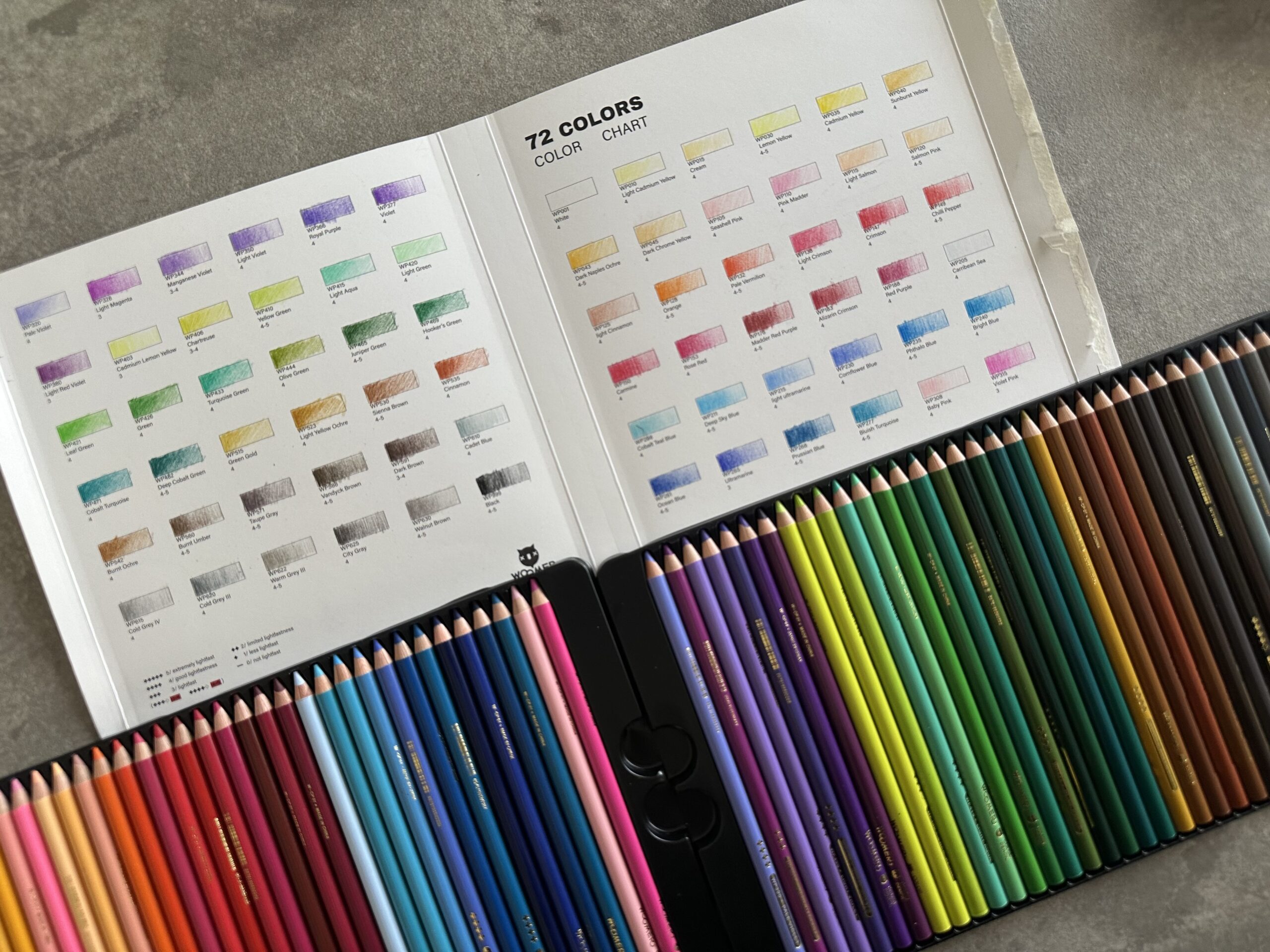
 Woomer Art Colored Pencils Review
 Graphite
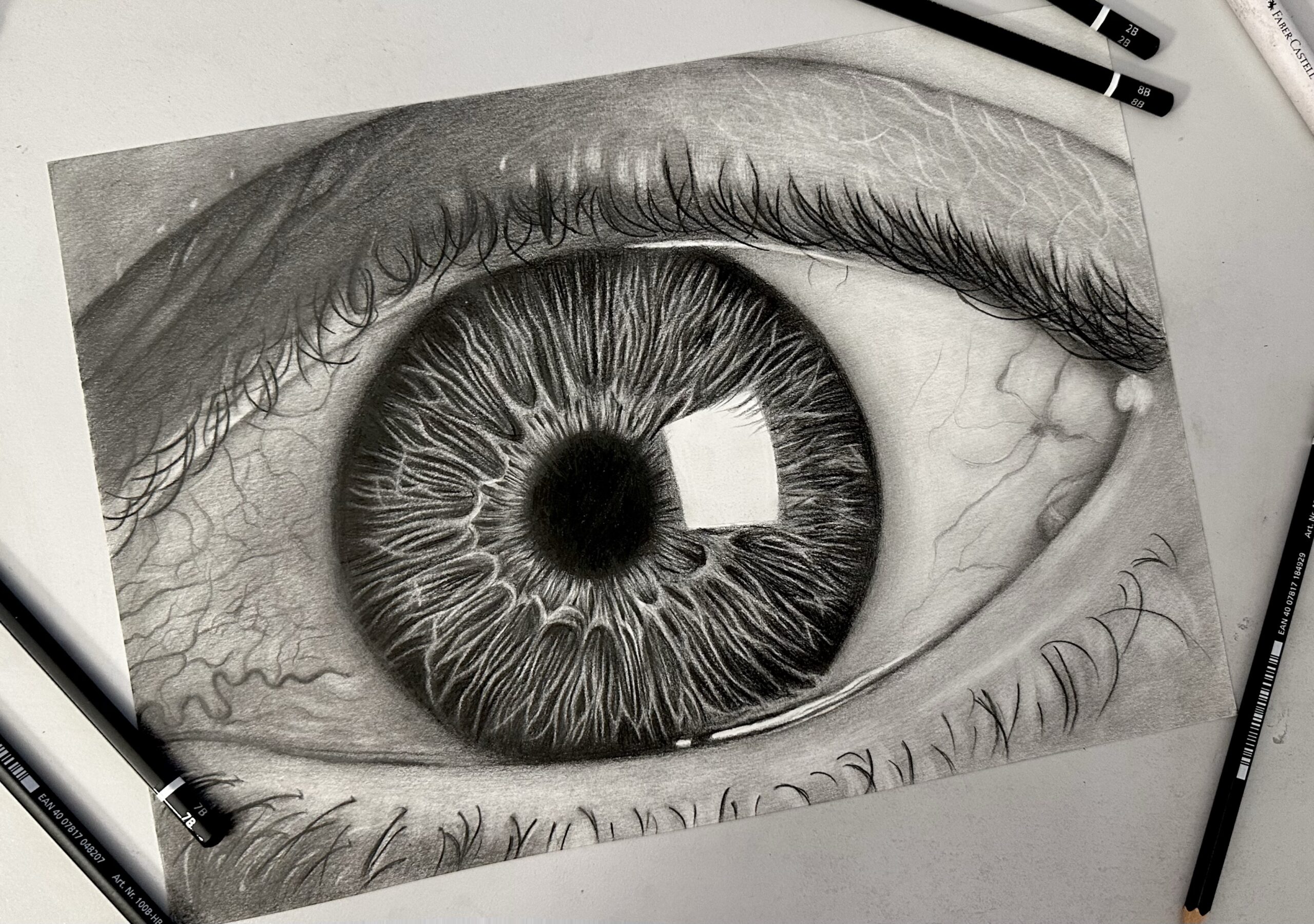
 Staedtler Mars Lumograph Black Review
 Arrtx
Arrtx