
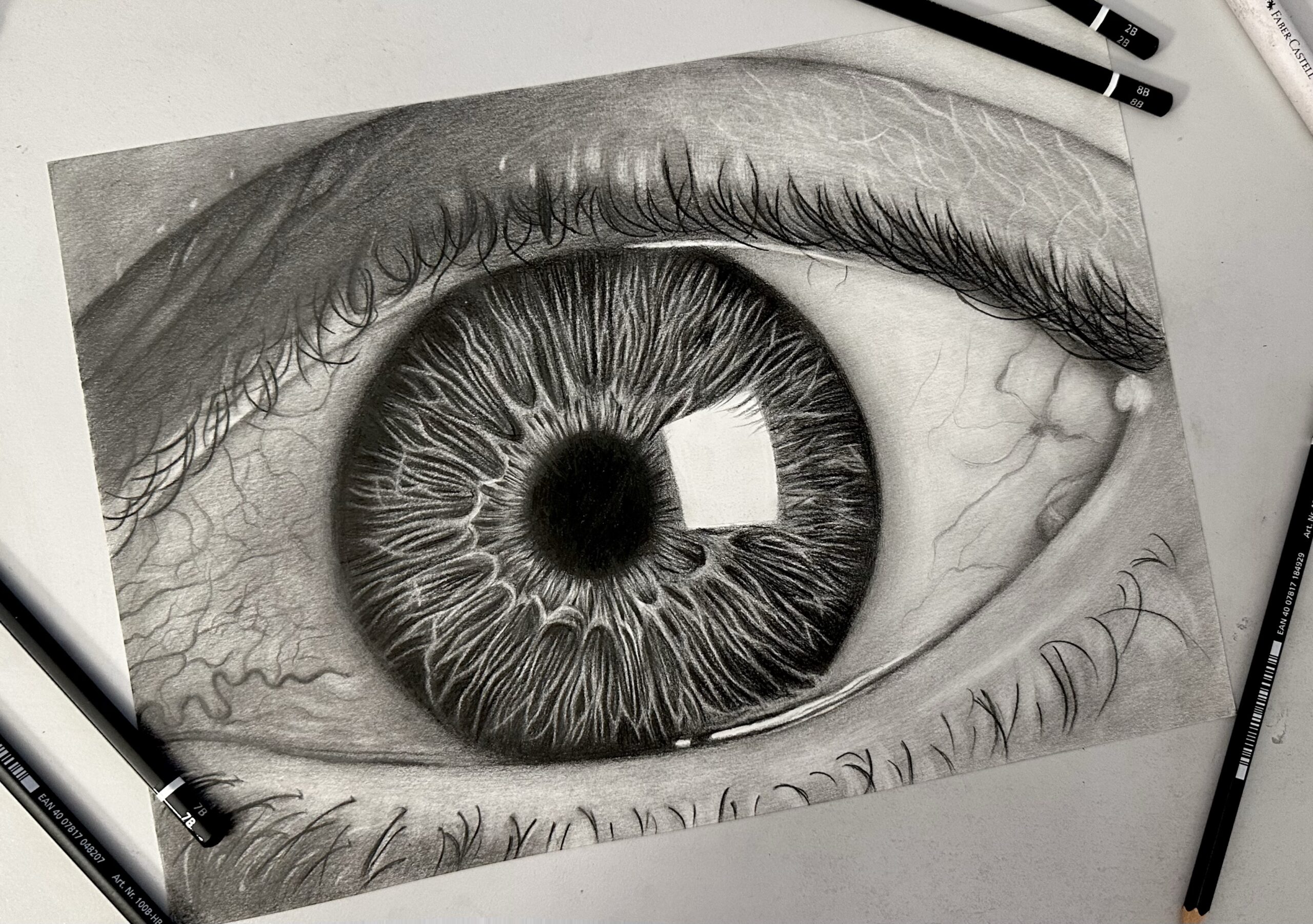
A skin tutorial again! A couple of years ago I did this tutorial for drawing realistic skin with color pencils. Up to this date I still use it as the basis for my drawings. However, it mostly targets beginners, so this time I opted for something slightly more advanced, to cover more complicated portraits as well. Without further ado, let’s get started!
To explain properly how I choose colors for my portraits, I will take a leaf out of digital artists book. When they start painting a face they start out with 3 colors: highlight, base color and shadow. (For a weird reason, that is unknown to me, traditional artists are more disorganized, they start off with countless colors and ending up making their life more difficult!)
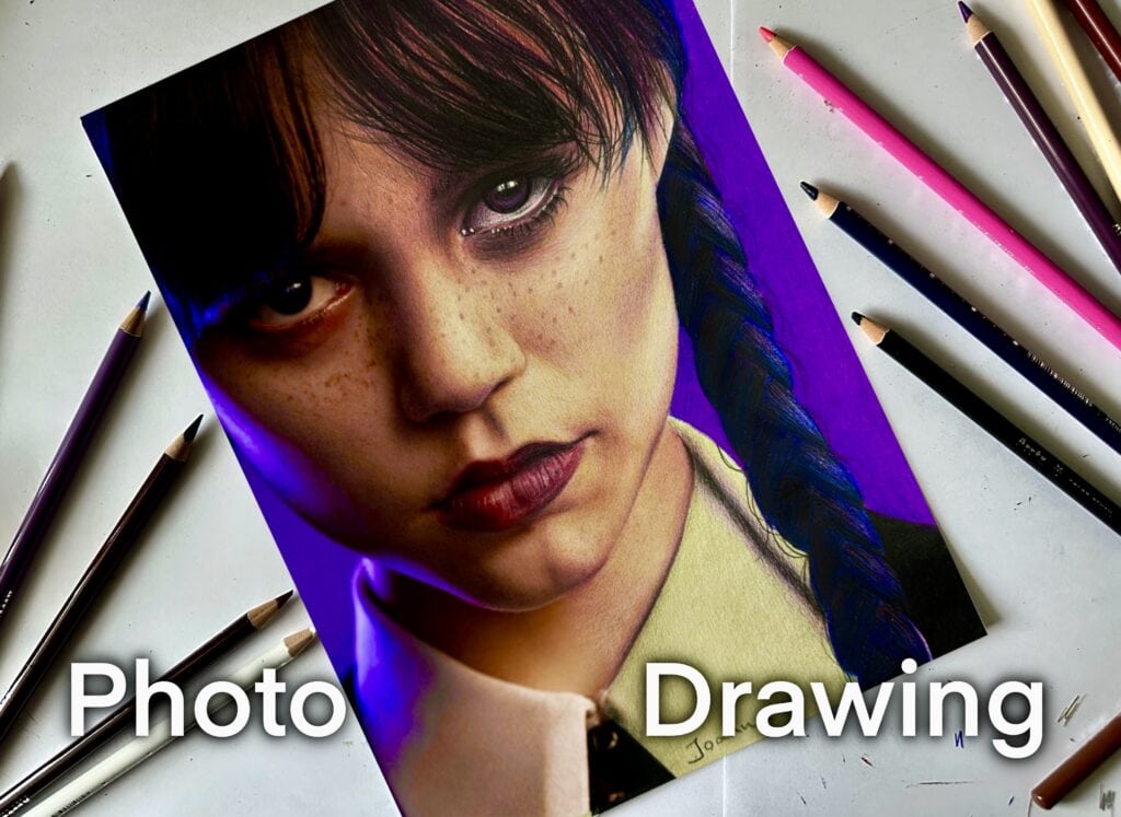
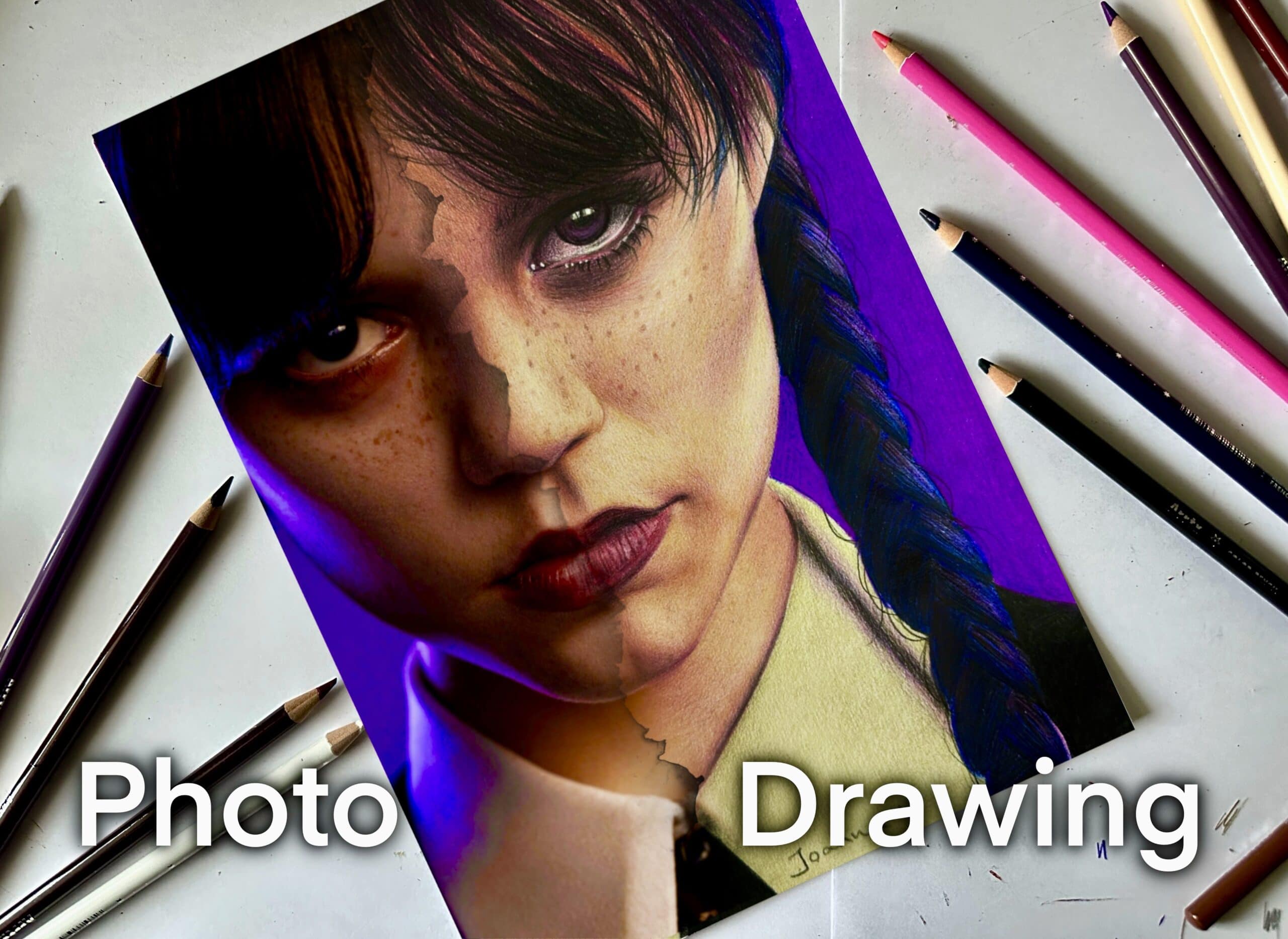
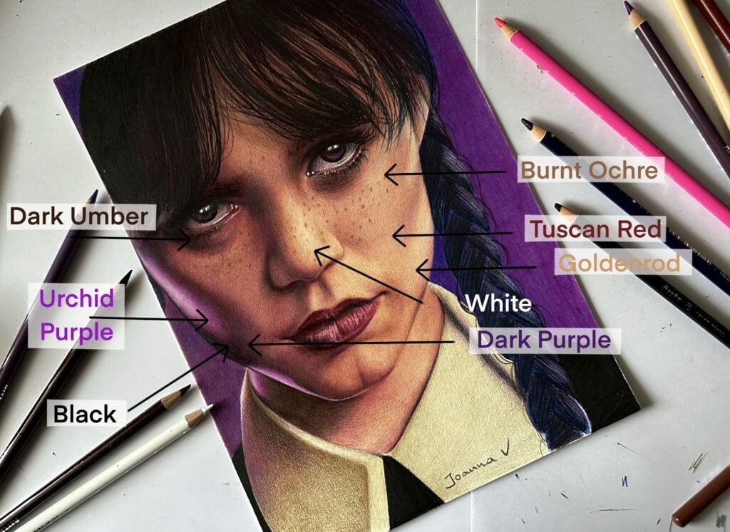
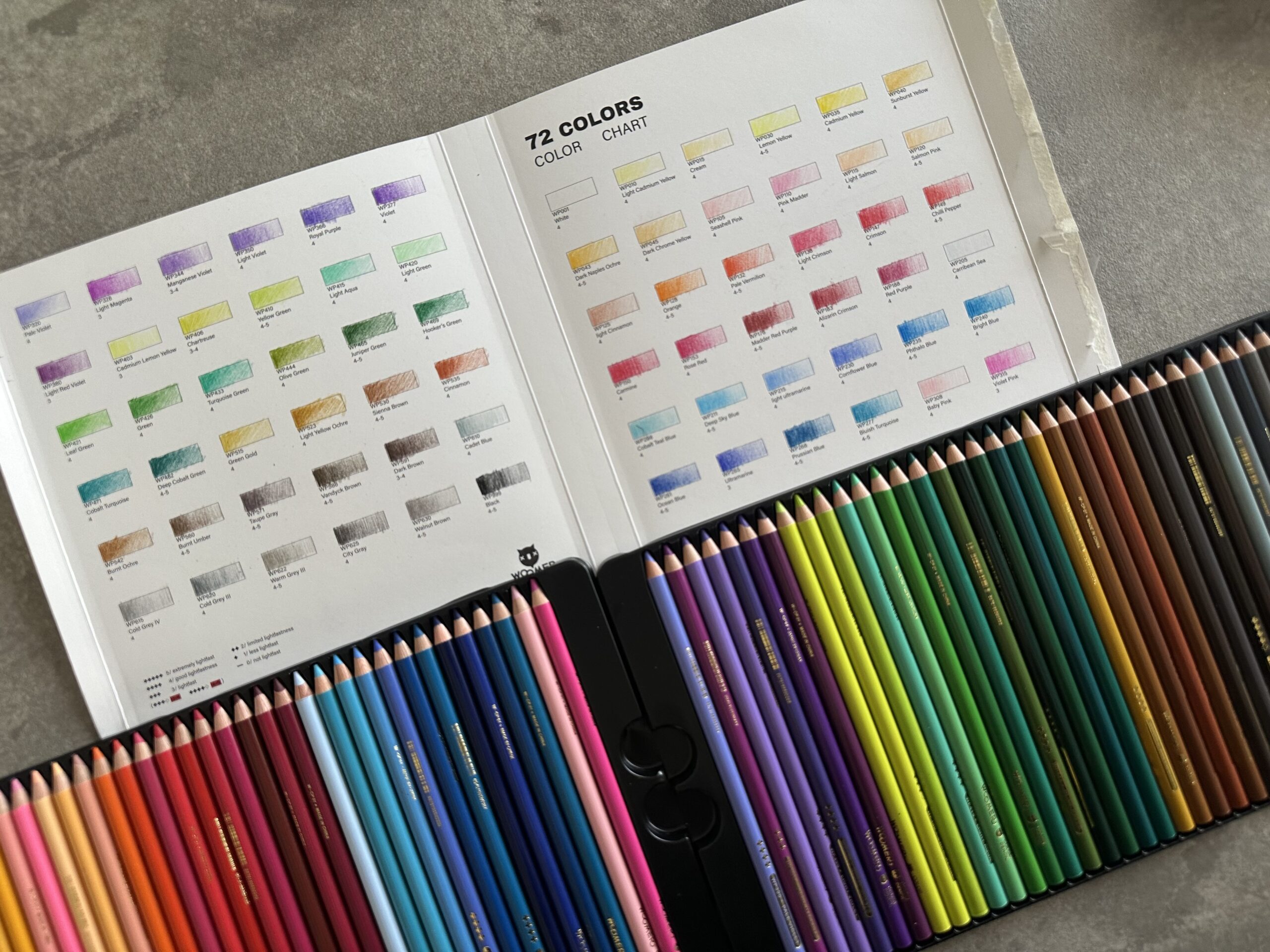
For this portrait of Jenna Ortega, I started off with 3 colors: (all out of Arrtx 126 colored pencil set, you can check out the review here), Goldenrod, Tuscan Red and Dark Purple.
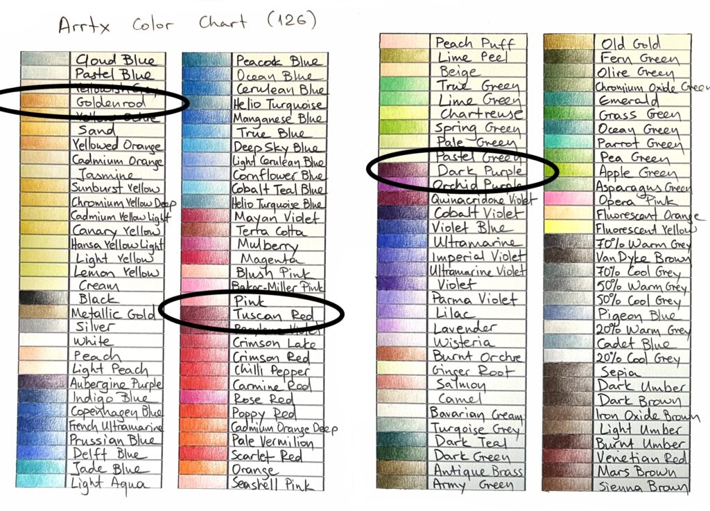
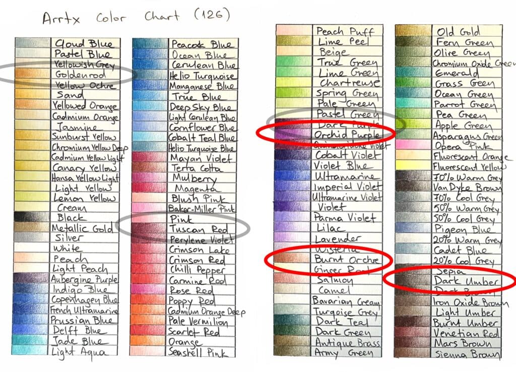
These will basically serve as highlight color, base color and shadow. This is where the previous tutorial stops. And the truth is that you don’t necessarily need anything more to create decent art. I notoriously use limited supplies from time to time. But most times, artists use more than just three colors to create realistic portraits. These additional colors will help warm the skin and bring the complexion to life. For that purpose I normally use a super bright, almost fluo color (here Orchid Purple), a mid tone brown to blend everything together (here Burnt Ochre) and a dark brown to intensify the shadows (here Dark Umber).
Finally, to create even more contrast, when everything else is done, I will go on top with a black and a white pencil to accentuate the super dark and super bright points of the face. This step should be done with a lot of caution because black can be harsh in a colored pencil drawing.
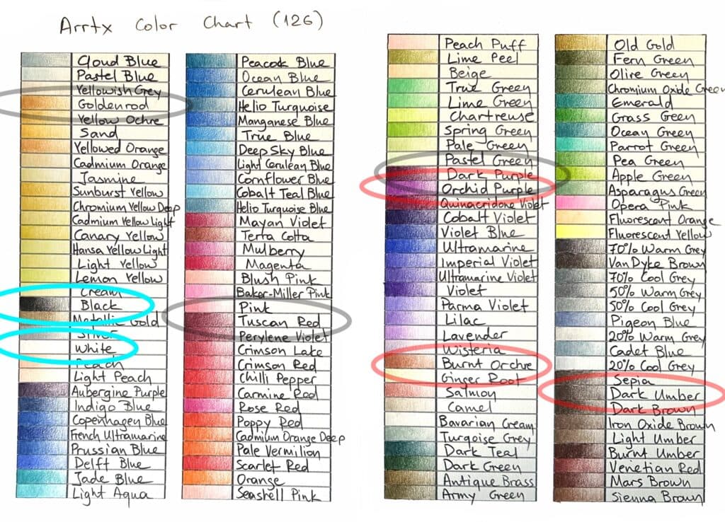
And this is the final color selection. To be completely honest, I used a lot more colors than these, but these additional ones could be skipped all together (I was mainly experimenting because this was my first work with Arrtx colored pencils).
So, the general idea can be summarized as follows:
With a lot of layering and blending I might add!
PS: As you … might have noticed I didn’t explain why I chose these particular colors. There isn’t actually any answer to that. It all depends on the mood and it’s mostly through trial and error. But what I can guarantee is this: As long as you choose your color palette this way, and stay consistent with this palette, there won’t be any coloring “mishaps”, the drawing will look professional and uniform, no matter what. (In contrast, if you keep changing colors without a proper plan, the drawing will probably look patchy and inconsistent) And that’s my current approach when it comes to creating portraits with colored pencils. What about you guys? Do you have any particular tips when it comes to making drawing portraits with colored pencils?
Arrtx 126 colored pencil set can be purchased here: (affiliate links*)
US: https://amzn.to/3Q6PNQZ *
CA: https://amzn.to/3vwEmZk *
UK: https://amzn.to/3GAoThe *
DE: https://amzn.to/3VGa4hE *
FR: https://amzn.to/3iapIE5 *
 Art discussion
 The future of Art (or why AI won’t take over)
 Colored Pencils
 My 5 top High End Artist Grade Colored Pencils
 Acrylic Markers
 Ohuhu Acrylic Markers Review
 Colored Pencils
 Woomer Art Colored Pencils Review
 Graphite
 Staedtler Mars Lumograph Black Review
 Arrtx
Arrtx
2 Responses
This is the best colouring pencil tutorial I’ve come across in the last few years. Thank you for sharing your tips! Great work.
Thank you Emily! I’m really happy you found it useful! 🙏