
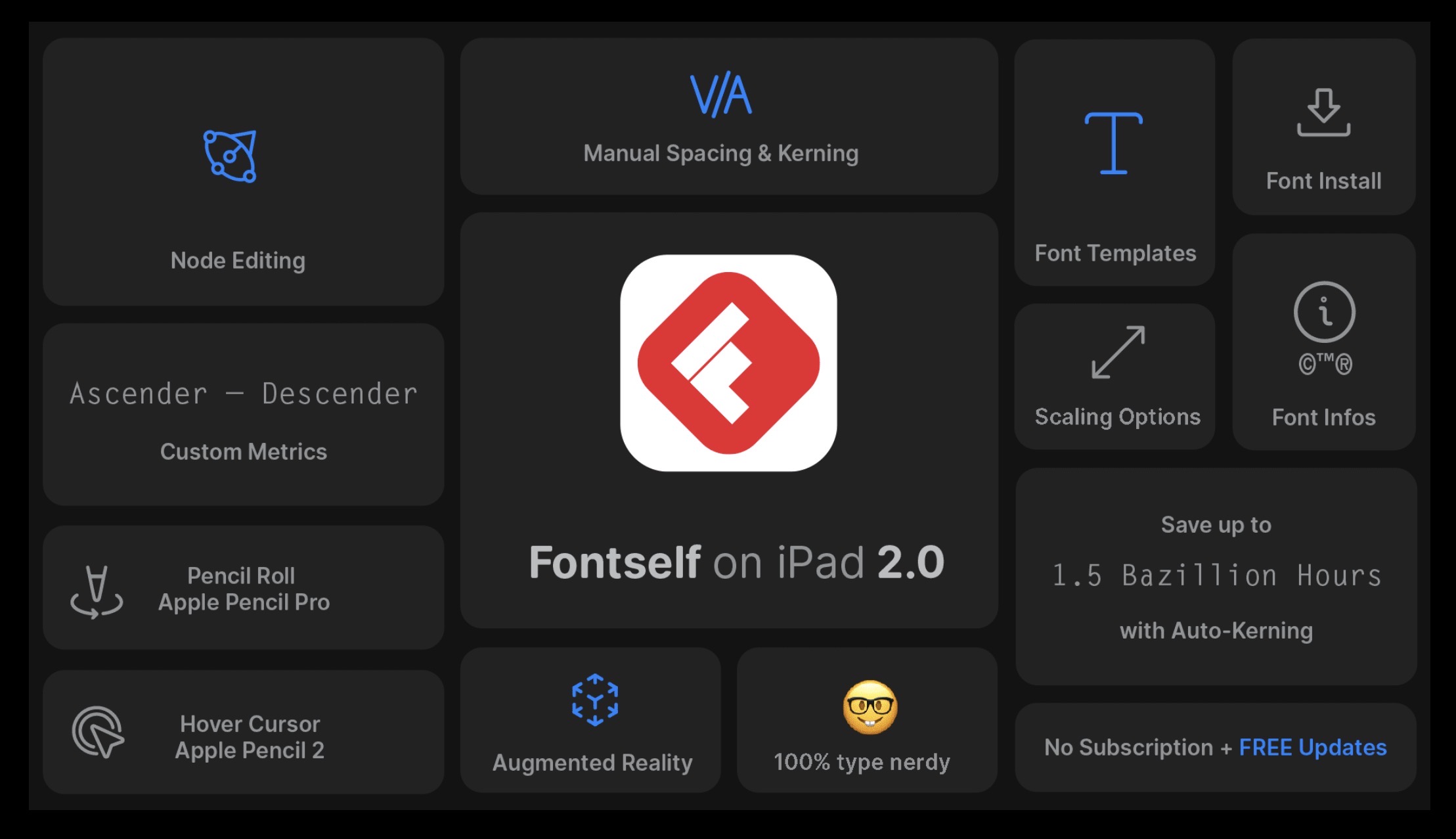
A couple of years ago I reviewed Fontself for iPad. This is a follow-up post, so you might want to check out that one first. In short, Fontself was an awesome app except for two issues, it didn’t allow manual kernings and it didn’t support Greek. I know you are laughing now, I would laugh too if I wasn’t Greek. Anyways let’s leave that for a moment, there’s still the first issue. What the h3ck are kernings?
By kernings we mean the spacing, the visual distance between two consecutive characters, and they are important because the spacing is part of the art when we deal with a font. A font without proper kernings is like having eg perfect eyes placed wrongly on the face.

There’s a lot more to kernings than meets the eye because the distance between characters is subject to human perception, there is no algorithm that can “solve” the problem. And they are important as they can make or break a font, they can degrade reading experience and finally let’s not forget marketing and how a font is used to manipulate the audience!
Take for example the images below. In the first, characters are spaced equally, and by equally we mean that the smallest distance between two consecutive characters is the same. But that isn’t a good kernings algorithm. Take the pairs t-h and f-o for example. The distance between each pair might be the same but the visual space is bigger between f and o. Hence kernings don’t always work the way we would have liked. Many automated solutions have been proposed but so far, the best kernings are those defined by the human eye…
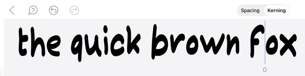
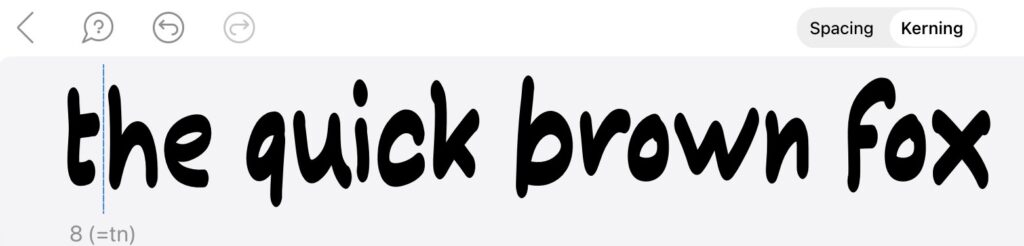
Back to Fontself. Previous version didn’t support custom kernings. They do now, though and, oh my Gosh, user experience is something I never … experienced (!) before, everything is so intuitive and effortless, and as soon as I touched the app I found my recently lost (sadly…) inspiration to make fonts again. And you know what a brute I can be when I review and scrutinize stuff. So I made a basic, hand-drawn, Blackletter font, to test kernings. A pretty crazy one, with lots of tails, supposedly a dummy font for the sake of this review. But it grew on me! Might turn it into a proper font sometime.
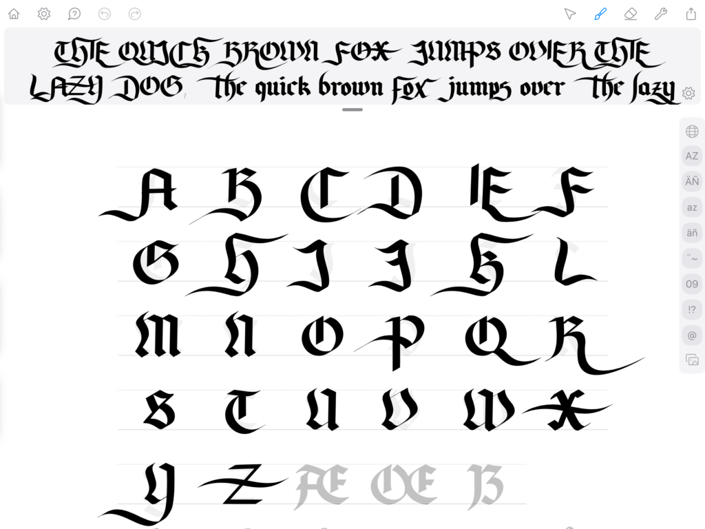
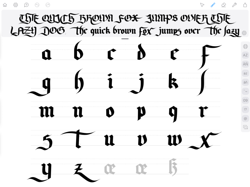
See what I mean? Pretty scary right?! Anyway, this is how it looks without kernings. As I mentioned in my other blog post, even though there were no custom kernings in the previous version of Fontself, the automatic kernings were exceptional.
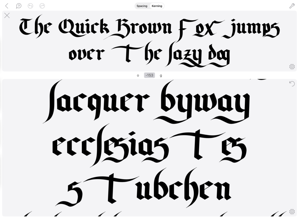
As you can tell it does a more-than-decent work to space consecutive characters. I only managed to confuse it a couple of times!
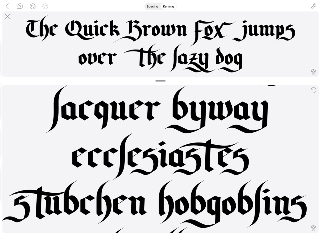
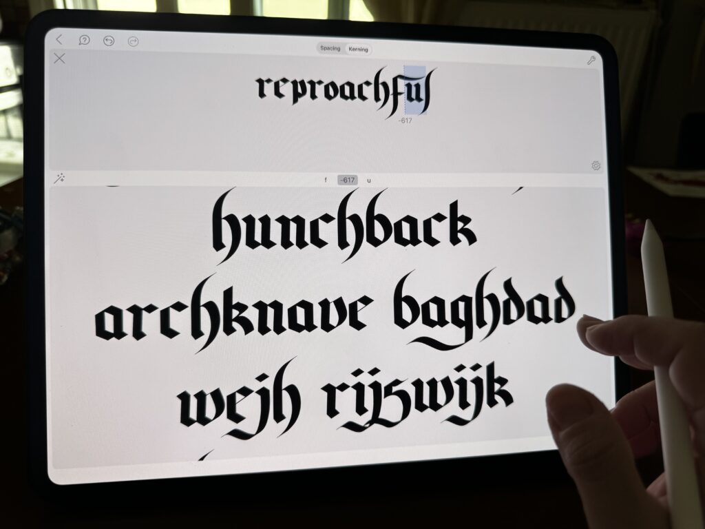
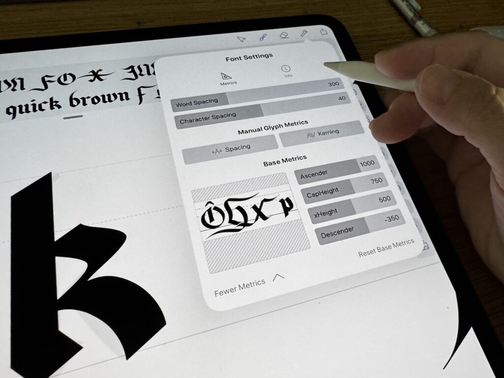
Another thing that I would like to add is that the process is so easy and intuitive, it makes kernings a joy! (And if you are a type designer, you know what I mean, kernings are never referred to as “joy”!) Just tap, drag, and voila.
Kernings tab can be accessed with a single tap on the utility icon. Additionally you can play with word spacing, edit ascenders, descenders and possibly do a bunch of other things I haven’t found out yet. Keep checking out this space for updates!
.
I always liked the app and honestly, kernings were the addition it needed. If you, like me, love working on the go, on the iPad, you might wanna consider trying Fontself for iPad, it’s solid, it’s professional, it’s portable and inexpensive, definitely worth a try. I have to leave now, I need to go and edit a font! 😉
PS: Fontself team contacted to inform me that they plan on working on non-Latin character support. One of the few companies that are so friendly and respectful to each individual customer. Can’t wait for the future updates. Till then, keep creating!

 3D
3D Berry’s Adventures: Behind the Scenes
 Acrylic Markers
 Review – Arrtx Liquid Ink Acrylic Markers
 Art discussion
 The future of Art (or why AI won’t take over)
 Colored Pencils
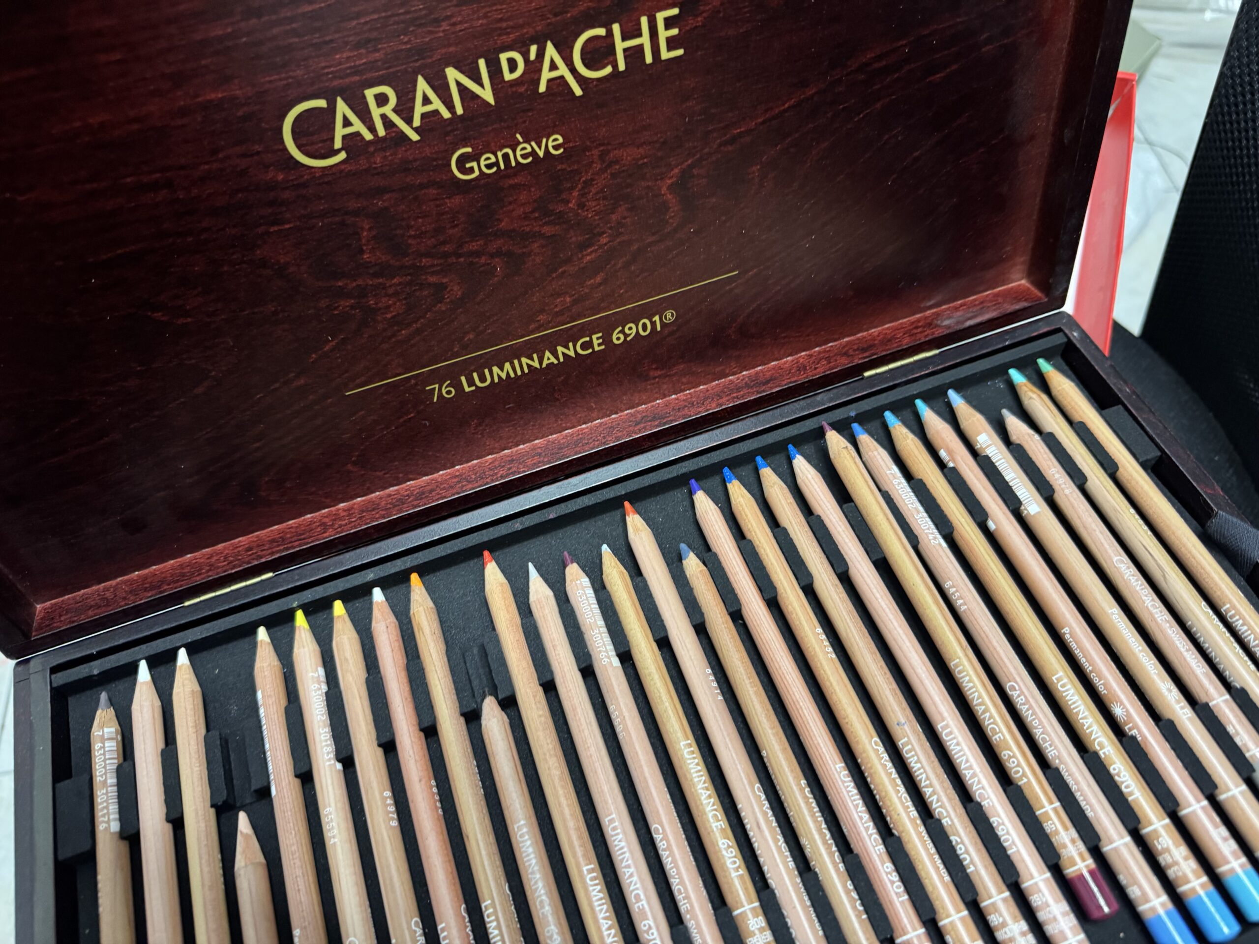
 My 5 top High End Artist Grade Colored Pencils
 Acrylic Markers
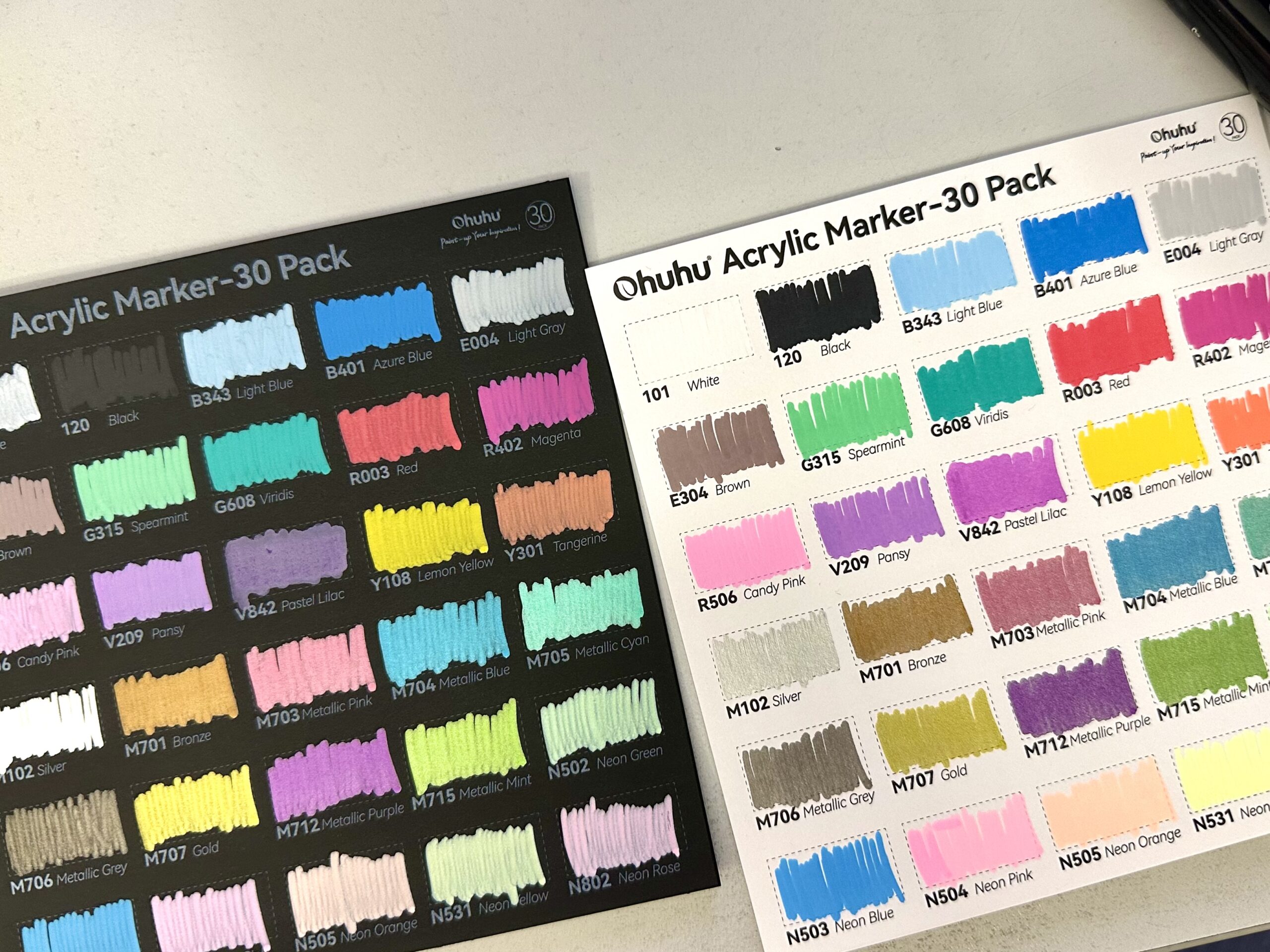
 Ohuhu Acrylic Markers Review
 Colored Pencils